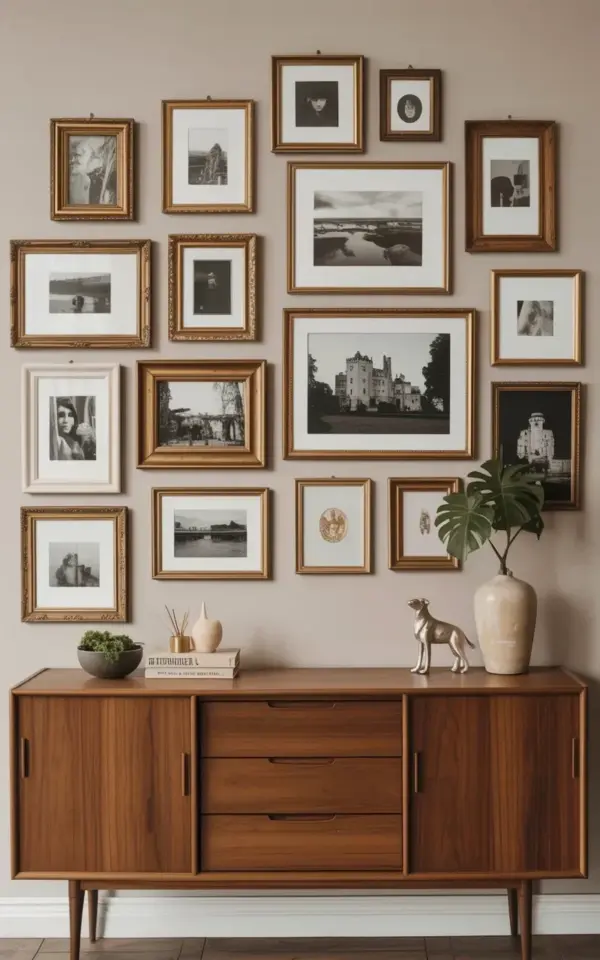
Imagine a wall that feels like a crisp autumn afternoon. In the photo, fifteen black and white pieces create a stunning **black and white gallery wall** against a warm beige backdrop. Ornate gold frames sit casually next to simple wooden ones, making the whole arrangement feel collected over time, like a treasure trove of memories. The eye immediately goes to the large castle photo anchoring the center, giving the entire space a sense of history and quiet drama. It feels curated but not overly designed, which is exactly the vibe you want for a cozy, lived-in home this season.
Recreating this look is easier than you think. It comes down to choosing a strong focal point, mixing your finishes thoughtfully, and embracing a relaxed layout. Here is how to bring this exact energy to your walls, broken down into a few simple design ideas.
The Anchor Piece: Going Big with a Castle Photo
Every great gallery wall needs a moment that stops you in your tracks, and here that moment is the oversized castle photograph. It grounds the entire asymmetrical layout, providing a solid visual weight that the smaller pieces can play around. The ornate gold frame around the castle gives it a regal, old-world feel, turning a simple landscape into a conversation starter.
When choosing your own anchor, think of a subject with strong lines or dramatic contrast. A castle, a grand staircase, or a lone tree in a field works beautifully. This is the piece that sets the mood for your whole **black and white photo wall**, so give it the largest frame and let it lead the composition without apology.
The Frame Mix: Blending Gold and Wood Tones
The secret to a curated look is pretending you collected these **vintage frames** over years of flea market trips. This wall nails it by mixing ornate antique-style gold frames with streamlined wooden ones. The contrast between the shiny metallics and the raw, earthy wood keeps the display from feeling too stiff or too casual.
Here are a few ways to replicate this balance in your own home:
- Use a dominant frame color, like gold, for about 60% of the pieces and wood for the rest.
- Try to match the undertone of your wooden frames to your existing furniture or flooring.
- Vary the widths of the frames to create depth and texture.
- Let the metallic finishes catch the low afternoon sunlight, especially during the fall.
This specific mix of gold and wood adds a level of warmth that simple black frames just can’t achieve. It makes the wall feel like it has a backstory.
The Layout: Mastering an Asymmetrical Gallery Wall Layout
Notice how the arrangement in the photo does not form a perfect rectangle or a rigid grid. The scattered placement of the 15 pieces creates a relaxed, organic flow that feels completely natural. Keep the spacing tight, around two inches apart, so the entire grouping feels like one cohesive unit rather than separate floating objects.
To map out your own **asymmetrical gallery wall layout**, cut out paper templates and arrange them on the floor before hammering any nails. Start with the large castle photo slightly off-center, then build outward with your smaller pieces. This layout is incredibly forgiving and easy to adjust, which takes all the pressure off trying to make it perfectly symmetrical.
The Color Story: Warm Beige and Fall Home Decor
The warm beige wall is the unsung hero of this entire look. It softens the stark contrast of the black and white photos, making the room feel cozy instead of clinical. This specific pairing is a masterclass in **fall home decor** because it brings in earthy warmth without relying on bright orange pumpkins or red leaves to get the point across.
To lean into the season even further in your own space, layer in natural textures like a chunky knit throw, a woven basket, or a leather ottoman. The neutral backdrop allows your living room to transition effortlessly from autumn into winter. It proves that a monochrome gallery wall can actually make a space feel more inviting, not less, and that beige is far from boring.
The Subjects: Curating Black and White Artwork
A great gallery wall always tells a story, and this one reads like a beautifully curated travel journal. It mixes landscape photographs, architectural scenes, and a few candid portrait studies. That variety of subject matter keeps your eye moving around the wall and allows you to discover something new every time you look at it.
When sourcing your own pieces, think strictly in black and white to ensure visual harmony. Architecture gives you sharp, structural lines; landscapes offer soft, dreamy textures; and portraits add a deeply
Leave a Comment