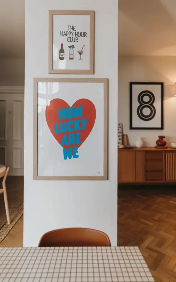
Three frames hang on a white wall in a room with a herringbone floor. The middle one is a red heart that reads “HOW LUCKY ARE WE” in a handwritten blue font. Above it, a smaller print says “The HAPPY HOUR CLUB” with a wine bottle and cocktail glasses. Over to the right, there’s a black and white number “8” that has no business being there, except that it totally does. That little cluster is a perfect example of a wall art arrangement that ignores the biggest mistake most people make: hanging every frame at the same height. It feels loose, layered, and alive. And it turns a plain wall into something you actually want to stare at.
Why the “Same Height Rule” Makes a Gallery Wall Feel Dead
When every frame sits on the exact same horizontal line, your eye travels across the wall like a marble on a track. It’s tidy, sure. But it’s also stiff. It reads as a waiting room, not a home. The moment you shift one frame up and another down, the wall starts to breathe.
The issue is that people treat eye level like a law. Eye level works for a single large piece. For multiple frames, it’s a trap. You end up with a row of pictures that all shout at the same volume, and the visual rhythm dies.
Look at that photo again. The “HOW LUCKY ARE WE” sign sits right in the middle of the cluster, but not perfectly centered. The happy hour club print is above it, practically hugging the top edge. The number 8 hangs to the right and slightly lower. Nothing lines up. And that’s exactly why it works.
How to Group Frames at Different Heights Without Losing Your Mind
Mismatched heights are easy to pull off if you think in triangles instead of straight rows. I know that sounds like a design school lecture, but stay with me. Pick one dominant piece, the red heart in this case, and build outward and upward from it. The eye starts at the heart, jumps to the happy hour club print, then lands on the number 8. That triangular path makes the whole group feel intentional.
You don’t need a measuring tape for this. Honestly, a measuring tape makes it worse. Hold the frames up, step back, and adjust until the negative space between them feels interesting. There’s a moment when everything just clicks, and it’s almost always a little lopsided.
If you’re nervous, start with three frames. That’s the easiest number to arrange because it forces you to break the same-height habit. Put one high, one low, and one in the middle. Then add more frames only if it doesn’t feel like a puzzle.
Mixing Typography, Illustration, and a Random Number: A Gallery Wall Theme That Works
The frames in this scene don’t share a color palette or a style. You’ve got a casual heart sign, a playful cocktail club illustration, and a stark black and white numeral. That’s not a cohesive set. It’s a conversation. And it works because there’s a common thread: they all feel personal, like souvenirs from a life you actually live.
Typography in wall art can be tricky. Too many words and it becomes a giant note-to-self. But the “HOW LUCKY ARE WE” sign hits that sweet spot between sentimental and everyday. It’s not preachy. It’s a mantra you can hang next to a wine bottle print and a lucky number without feeling like you’re decorating a hotel lobby.
The number 8 is the wild card. It doesn’t have a story tied to the happy hour theme. It’s just there. That’s what makes it interesting. A gallery wall should have at least one object that makes someone ask “why do you have that?” Your answer can be “no reason” or “it’s my favorite number” or “I found it in a thrift store three years ago.” All of those answers are better than “everything matches.”
Gallery Wall Over a Sideboard: Let the Furniture Set the Anchor
A sideboard is a great anchor for a wall art arrangement because it gives the frames a base. You don’t need the frames to carry the whole room. In the photo, the wooden sideboard is partially visible, and the white column next to it adds a clean vertical line. The art floats above the furniture in a way that feels connected but not crowded.
Here’s the trick: leave a visible gap between the sideboard top and the lowest frame. About 6 to 8 inches is a good rule. Too close and the art feels heavy. Too high and it looks like you made a mistake.
If you’re styling a sideboard yourself, put one or two small objects on it, maybe a lamp or a stack of books. Don’t clutter it. The wall art is the main event, and the furniture is just the opening act.
When the Herringbone Floor Does the Heavy Lifting
I have to say it. That herringbone floor is stealing the show a little. The angled wood planks add so much motion that the wall art only needs to do a fraction of the work. That’s a reminder that your floor, your wall color, and your lighting are all part of the arrangement. A gallery wall doesn’t exist in a vacuum.
If your room has plain floors and white walls, you might need bolder art or more dramatic spacing. If you have a busy floor like herringbone, you can get away with a looser, more imperfect wall layout. The floor provides the structure, so the frames can play.
Not everyone has that floor, and that’s fine. The takeaway is to look at the whole room, not just the wall. What is the background already giving you? Work with it instead of against it.
Perfectly Imperfect Gallery Wall Rules to Steal (and One to Break)
I’m not a fan of hard rules, but a few loose guidelines genuinely help. Here’s what I actually use when I hang a gallery wall in a living room or hallway:
- Start with an odd number of frames, usually three or five. It makes the arrangement feel more organic.
- Keep the largest or boldest piece off-center. Trust me, it looks better.
- Vary the frame styles and colors, but try to keep a shared visual weight. A thick wood frame next to a thin metal one can work if they’re both dark.
- Step back after every single hang. No exceptions.
- Break the “6 inches above furniture” rule if your ceiling is high. Sometimes a floating cluster looks amazing a full foot above the sideboard.
That last one matters. Look, rules are for getting started, not for making everything look identical. The best gallery walls have one small weirdness. A frame slightly crooked. A gap that’s a little too wide. A number 8 that nobody asked for. That’s the perfectly imperfect part.
Don’t Stress About Perfection. Save This for Later.
If you’re staring at a blank wall right now, start by gathering the art you already have. Don’t buy a matching set. Don’t spend a whole weekend planning. Just lay the pieces on the floor, move them around, and hang them in a way that feels like you.
The same-height mistake is easy to make and just as easy to fix. Nudge one frame up. Slide another down. Add a random number if you have one. Your wall will feel less like a showroom and more like a home.
Save this for your next wall project, and don’t forget to look at your floor while you’re at it. It might be doing more than you think.
Leave a Comment