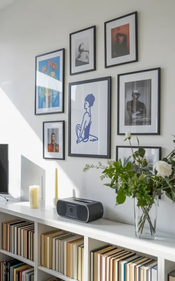
Three blank walls. That’s what I was staring at after moving into a place with zero built-in character. The fix wasn’t a giant canvas from a home goods store, because honestly, my bank account said no. This budget gallery wall came together for less than the price of a fancy dinner. The photo you see, with those black frames holding blue-toned prints and vintage portraits above a white bookshelf, it’s a real room, not a magazine spread. And it all started with a simple rule: stick to one color scheme, let the frames do the heavy lifting, and never pay full price. That’s the whole budgetgallerywall secret, right there.
Why Your Gallery Wall Looks Wrong, Not Authentic
You bought the frames, hung them in a straight line, and something still feels off. I know that frustration because I’ve done it too. The usual culprit isn’t the art or the frames, it’s the monotony of everything being the same size.
Look at the arrangement in the photo. You’ve got a taller piece, a couple of smaller portraits, and that gorgeous blue illustration with the figure and flowers. They break the visual rhythm.
The fix for your own wall is to mix frame orientations. Use a landscape piece next to a portrait one. Throw in a square or two. That irregularity reads as curated, not chaotic. Avoid the trap of buying a pre-packaged set of four identical frames, unless you want your living room to look like a waiting room.
The Cheap Frame Trick That Looks Expensive (It’s All About Mass)
Not gonna lie, cheap frames can look truly terrible if they’re flimsy and light. Here’s the thing, the trick isn’t finding expensive frames at a thrift store. It’s making the cheap ones you buy look substantial.
Use a mat. Seriously, a simple white or off-white mat instantly makes a five-dollar frame read as a twenty-five-dollar one. Get a roll of black craft paper and cut your own mats for a rustic look.
The second part of the trick is grouping them tightly. Look at the photo again, the frames sit close together on the white wall. They form one cohesive mass. When you leave too much space between frames, the wall looks sparse and the individual frames look cheaper. Tight grouping creates visual weight. For this project, I used black frames specifically to create a strong contrast against the white wall, which draws your eye immediately to the colors inside the art.
Bookshelf Styling Mistakes Nobody Tells You About
That white bookshelf below the wall isn’t just storage, it’s part of the composition. Most people just shove books in vertically and call it done. That’s a missed opportunity.
The key here is vertical and horizontal stacks. You see it in the photo. Some books stand up, others lean or stack flat. This variation adds texture and makes the shelf feel styled. Those beige and brown hardcovers against the white shelf create a warm foundation.
Here’s my honest opinion on color sorting. Don’t do the rainbow thing, it looks forced. Stick to a narrow palette. Beige, cream, brown, maybe a few black spines. That monochromatic look ties into the black frames and blue art in the wall. Get rid of the clutter too. A few weird trinkets are okay, but don’t fill the shelf with tchotchkes. And that little black speakeasy item on the shelf? That’s a cool functional piece. Having *one* functional object adds a story. It’s not just decoration.
Finding Art That Won’t Break the Bank
The blue prints in the photo are a perfect example of affordable wall decor. I didn’t buy originals. I used a mix of secondhand books, old calendars, and some free downloads I printed at the local print shop.
You want to know a secret? The printer does all the heavy lifting. Print a botanical illustration on good paper, put it in a black frame, and no one knows you spent forty cents on the print.
Do not overlook thrift stores. Look for the frames first, not the art. If the frame is good, you can always swap the print inside. Look for anything with a blue tone or a portrait. That cohesive color is what makes the messy mix of images look intentional. It’s like the paint color is the thread that holds the whole idea together.
Arranging Without Leaving a Million Nail Holes
You don’t want a wall that looks like swiss cheese, so let’s avoid the guesswork. Use butcher paper.
Trace your frames onto paper, cut the shapes out, and tape them to the wall. Move them around until you love the layout. This is the most practical gallery wall idea for renters or anyone with a hammer fright. It takes an extra fifteen minutes, but it saves your wall.
Here’s a simple list for the arrangement flow:
– Start with the largest piece, usually the blue illustration, off-center.
– Balance the heaviness with smaller pieces on the opposite side.
– Keep the gaps consistent, about two inches works well.
– Step back every time you tape a new piece.
In the photo, the arrangement sits directly flush with the top of the bookshelf. That line is important. Don’t float the art too high. You want the wall art and the shelf to feel connected.
Why Portraits Add That Personal, Curated Touch
A wall full of abstract art is fine, but mixing in a couple of portraits changes the energy. There’s a specific depth to a portrait, especially a black and white one. It feels human.
In the image, the portrait style photos sit among the sketches. They’re not just placeholders, they give the eye a place to rest. If you feel weird about hanging pictures of strangers, use family photos in sepia tone. Print them in black and white so they don’t shock the color scheme.
If you’re working with minimal wall art, like one big piece, the portraits help create the layering effect. They fill that gap between the taller art and the bookshelf below. It’s a trick interior designers use, and you’re now in on it.
Adding a Weird Personal Detail (The Fun Part)
Gallery walls go wrong when they’re too perfect. Immaculate rows, same size frames, perfectly matched art. Boring.
I once left a tiny framed moth wing in the middle of a large wall and it sparked more conversation than the entire collection put together. So, find your weird piece. It could be an old map, a pressed flower, or a page from a vintage dictionary. In the photo, the dark tones of the books and the black frames create that moody, collected-over-time feel.
It’s the imperfections that make a house feel like a home. Don’t overthink the exact measurements. If a piece is slightly too high, who cares? Once you step back, you won’t see the flaw, you’ll just see the whole.
Wrapping Up the Budget Gallery Wall Journey
This whole project proves you don’t need expensive art galleries to have a beautiful wall. You need patience, a solid color rule, and the willingness to look at the space as a whole unit, wall art *plus* shelf styling. The photo shows exactly how the black frames pop against a white wall, while the blue and brown tones keep everything grounded.
Take a hard look at your blank wall. Gather up the secondhand finds, print the free downloads, and hang them tight together. It’s a fun afternoon project that completely changes the way your room feels. I’d love to hear if you finally got that wall right, tell me what you used as your centerpiece.
Leave a Comment