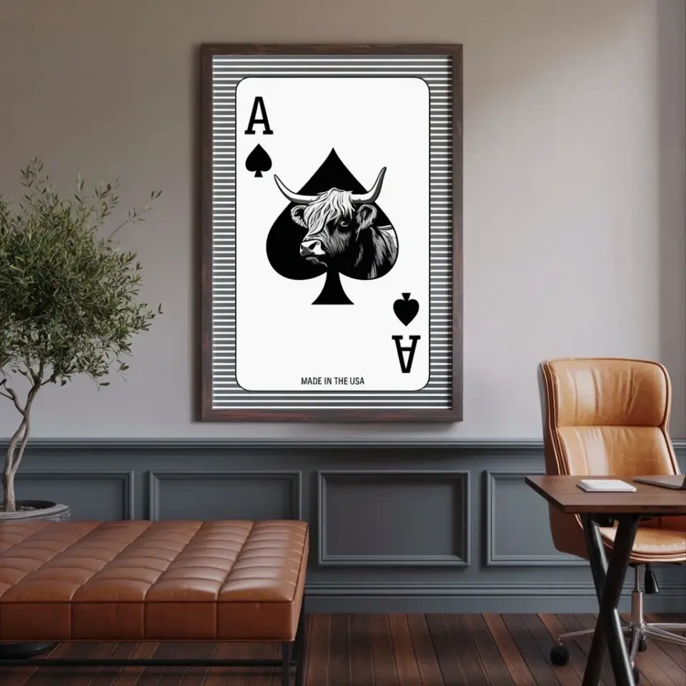
I have made every mistake in the book when it comes to gallery walls. I have spent too much on frames that did not match, hung everything too high, and ended up with a wall that looked cluttered instead of curated. But after a few do-overs, I finally figured out how to get that collected-over-time look without the price tag. If you are hunting for budget gallery wall ideas that actually look polished, you are in the right place. I styled an entire wall using thrifted frames and free printable art for under $30, and I am going to walk you through the common mistakes I made so you can skip them and save both money and frustration.
Mistake #1: Skipping the Layout and Hanging Blind
Nothing screams “first attempt” like a gallery wall where everything is crooked and spaced unevenly. I used to grab a hammer and start nailing, assuming I could fix it later. That never worked. The frames always ended up too close together or too far apart, and I had to patch holes and start over.
Instead, trace each frame onto kraft paper or old wrapping paper, cut out the shapes, and tape them to the wall. Move the paper templates around until the spacing feels balanced. Leave about two to three inches between each frame. This trick costs nothing and saves you from a wall full of unnecessary holes.
How to Mix Frame Sizes and Finishes Without Clashing
A common budget gallery wall mistake is using frames that are all the same size and color. That can look like a store display, not a personal collection. But the opposite extreme, grabbing every random thrifted frame you see, can look chaotic.
Here is a simple formula that works every time: pick one dominant finish (like black or natural wood) and then add one or two accent finishes (like gold or white). For sizes, use a large anchor piece (think 11×14 or bigger) and then layer in medium and small frames around it. I found a chunky gold frame at a garage sale for a dollar and painted it matte black to match my scheme. That one piece tied everything together.
Forget Expensive Art: Use Free Printables Strategically
Overspending on art is probably the fastest way to blow your budget. I used to think I needed original prints or pricey posters. Then I discovered free printable art from library archives and museum websites. The New York Public Library, the Smithsonian, and sites like Unsplash have high-resolution images you can download and print for a few cents.
But the mistake is printing them on cheap copy paper. That looks flimsy and wrinkled in a frame. Instead, print on matte presentation paper or lightweight cardstock for a dollar more. I printed a vintage botanical illustration and a minimalist line drawing, both free, and they look like they came from an art store. Here are my go-to sources for free art:
- New York Public Library Digital Collections (old maps, botanical prints, vintage ads)
- Unsplash (search “minimal art” or “abstract” for modern options)
- Rawpixel (has public domain images already color-corrected)
- Your own phone camera (black and white photos of your travels look like expensive prints)
Why Frame Depth and Matting Matter More Than You Think
I once thrifted a frame that was really shallow, and when I put the printable inside, the glass pressed right against the paper. It looked flat and cheap. A deeper frame, even a basic one from a dollar store, creates a shadow box effect that makes the art feel substantial.
Another mistake is skipping the mat. You do not need to buy custom mats. You can cut your own from a large sheet of matboard (under $10 at a craft store) or use a pre-cut mat in a standard size. A white mat instantly makes a small print look gallery worthy. I used a single 8×10 mat with a 5×7 opening, placed a free print behind it, and the whole thing cost me about two dollars per frame.
Hanging at the Right Height: The 57-Inch Rule
The most common gallery wall mistake is hanging everything too high. I see it all the time. People hang the center of their arrangement at eye level, but they forget that eye level for most people is around 57 to 60 inches from the floor. If you hang the center of your arrangement at that height, the bottom frames will not be too low for sitting areas and the top frames will not vanish near the ceiling.
For a gallery wall above a sofa, leave about six to eight inches between the top of the sofa back and the bottom of the lowest frame. For a hallway, aim for that 57-inch center point. I marked the wall with a pencil, then used my paper templates to get the spacing right. No measuring tape required after that.
How to Mix Personal Photos With Printable Art
A gallery wall that is only free printables can feel impersonal. A gallery wall that is only family photos can feel like a hallway in a dentist office. The trick is to mix them in a way that looks intentional.
I printed a few of my own photos in black and white to match the neutral tones of the printables. Then I framed a small handwritten note from a friend in a thrifted frame. That added texture and meaning without costing a dime. Keep the color palette consistent. If your printables are mostly black, white, and soft greens, edit your personal photos to black and white or a similar muted tone before printing. Your phone probably has a filter that does this in seconds.
Use Command Strips for Renters and Crooked Walls
I used to think nails were the only option, then I moved into an apartment with plaster walls. Command strips saved my gallery wall. They are not just for dorm rooms anymore. The Velcro style picture hanging strips hold framed art up to several pounds, and they come off without damaging the paint if you pull the tab straight down.
The mistake people make is not using the correct weight rating. Always buy strips rated for a few pounds more than your frame weighs. Also, clean the wall with rubbing alcohol before sticking them on. I have had frames stay up for over a year with no issues. And when I moved out, the wall looked exactly like it did when I moved in.
Putting together a budget gallery wall is really about making smart choices with what you already have or can find cheaply. Thrifted frames, free art, a few personal touches, and a little planning can give you a wall that looks like it was professionally styled. I saved over a hundred dollars compared to buying everything new, and my wall actually feels like me.
If you try any of these ideas, let me know how it goes. I love seeing how people make spaces their own without spending a ton. Save this post for your next project and start collecting those thrifted frames.
Leave a Comment