Why I Chose a Symmetrical Layout for My TV Wall
When I first started looking for budget TV gallery wall ideas, I thought framing a mounted flat screen would cost a fortune. Custom framing, professional installation, matching artwork – it all seemed out of reach. But after moving into a new apartment with a bare living room wall, I decided to try a thriftier approach. I sketched three layouts using only a wooden media console, a mounted TV, and white picture frames in standard sizes. To my surprise, each setup looked clean, intentional, and nothing like the cluttered gallery walls I had imagined. The key was symmetry and a strict color palette – black, white, and warm wood.
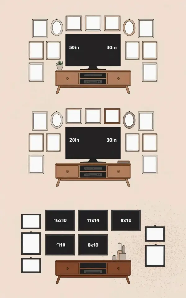
For this project I used a simple 50‑inch TV (labeled 50in by 30in in my reference illustration), a secondhand console with two drawers, and frames I already owned or found at a local thrift store. The result felt both personal and polished, and the total cost stayed under $60. Here is what I learned from testing these three layouts.
Starting with a Symmetrical Layout (and a Thrifted Media Console)
The foundation of any TV gallery wall is the media console. I wanted something low and wide to anchor the TV without stealing attention. A friend gave me a wooden console with two drawers – it had a few scratches, but a coat of matte polyurethane fixed that. The warm oak tone helps soften the black screen and white frames above it.
Symmetry became my rule because asymmetrical arrangements looked messy with the TV as the center point. I placed the TV exactly in the middle of the console and then measured equal spacing on both sides for the frames. This creates a calming, orderly look that works especially well in small living rooms. If you prefer a more eclectic feel, you can break symmetry later by swapping one frame for a different shape. But for a budget‑friendly start, symmetrical is the easiest to pull off.
Layout 1: Single Large TV with Simple White Frames
This is the arrangement I ended up using in my own home. I mounted the 50‑inch TV so its bottom edge sits about 6 inches above the console. On each side I hung two white 11×14 frames with the long side vertical. The frames are spaced 4 inches apart and align with the top edge of the TV. The effect is a clean rectangle around the screen – almost like a built‑in picture frame.
I used thrifted frames that originally held old prints. I removed the backing and replaced the artwork with plain white mats. This cost me $8 total for four frames. The image I worked from labeled the TV dimensions as 50in by 30in, which gives enough wall space on either side for a pair of frames without crowding. If your TV is larger or smaller, adjust the frame count – two per side worked perfectly here.
Layout 2: Mixing Frame Sizes – 8×10, 11×14, and 16×10
For the second layout I wanted a bit more variety. I kept the same media console and TV, but instead of using identical frames, I mixed three sizes: an 8×10, an 11×14, and a 16×10 (the wide landscape orientation). On the left side I placed the 16×10 frame at the top, the 11×14 below it, and the 8×10 at the bottom. I mirrored that arrangement on the right side.
This creates a staggered column effect that draws the eye up and down. The 16×10 frame sits just above the TV’s midpoint, which helps balance the visual weight of the screen. I found that using the same white mat and black frame style across all sizes kept the wall from feeling chaotic. If you are mixing frames from different thrift stores, spray‑paint them all the same color – it costs $5 and makes everything look coordinated.
Layout 3: Keeping It Minimalist with a Smaller TV
Not everyone has a 50‑inch TV. In the third example I imagined a smaller screen, about 32 inches, centered on the same console. On each side I hung just one frame – a 16×10 in landscape orientation. The frames sit slightly lower than the TV’s center, so they feel connected to the console rather than floating in space.
This layout is ideal for a bedroom or a small den. The single frame per side gives the wall breathing room while still defining the gallery theme. I used a thin white frame from a dollar store and cut a piece of art paper to fit. The total cost for two frames was under $10. If you want even more negative space, you can skip the frames on one side and place a small plant on the console instead – but then you lose the symmetrical feel that makes the gallery wall read as intentional.
How to Source Frames on a Budget
Frames are the most expensive part of a gallery wall if you buy them new. Here is what worked for me:
- Thrift stores and garage sales. I found nearly identical white frames for $2-$4 each. Look for solid wood or resin, not cheap plastic that warps.
- Reuse frames from old posters. Flip them over and replace the artwork with plain cardstock or fabric.
- Spray paint mismatched frames. A can of matte white spray paint ($6) can unify six different frames in under an hour.
- Check Facebook Marketplace. People often sell bundles of frames for $10 when they redecorate.
Stick to the standard sizes I used – 8×10, 11×14, and 16×10 – because those are the easiest to find secondhand. Avoid odd sizes like 12×16 unless you are willing to cut custom mats.
Tips for Mounting and Arranging Your Gallery Wall
Before you drill any holes, lay the frames on the floor below the TV and experiment with spacing. I used painter’s tape to mark the horizontal and vertical lines on the wall. A good rule of thumb is to leave 3-5 inches between the TV and the nearest frame and about 2 inches between frames themselves. This prevents the wall from looking crowded.
For mounting, use a sturdy TV bracket that keeps the screen flush against the wall – a tilted bracket can cast shadows behind the frames. I also recommend installing picture wire on the back of each frame so you can adjust the position without moving the nail. If you rent, use picture hanging strips rated for the frame weight; they hold well on smooth walls and remove cleanly.
Finally, consider the viewing distance. A gallery wall works best when the frames are close enough to the TV that they feel part of the composition, but far enough that they don’t distract from the screen. I tested the layout by sitting on my couch and taking a photo – if any frame cut into the TV’s bezel visually, I moved it outward an inch. Small adjustments make a big difference.
Why This Approach Saved Me Time and Stress
I spent a total of three weekends sourcing frames, painting them, and mounting everything. The symmetrical layouts meant I only had to measure once per side. Because I used standard frame sizes and a single color scheme, the wall came together without second‑guessing. More importantly, the budget stayed under $60 – including the secondhand console – and the room now has a curated look that visitors assume cost hundreds.
If you are worried about the TV being the centerpiece, don’t be. The frames draw attention outward and make the screen feel like part of the decor rather than an interruption. This works especially well in minimalist living spaces where every element needs to earn its place. I have already started planning a second gallery wall for my hallway using the same mirrored‑column approach.
Save this for your next living room update. Start by mapping out your own three layouts on paper, then hit the thrift stores with those frame sizes in mind. With a little patience and a can of spray paint, you can turn a bare wall into a personal gallery without breaking the bank.
#gallerywall #tvmounting #framedart #budgetdecor #minimalistliving
Leave a Comment