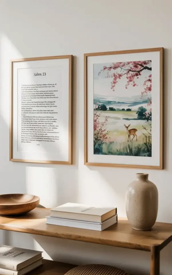
There’s a corner in my bedroom that I used to ignore entirely. Now it’s the first thing I see when I walk in, because I finally made myself some budget wall art that doesn’t look budget at all. On the left, a black and white print that says “SALMS 23” at the top (yes, with the typo, I almost fixed it but then decided I liked it), followed by the full scripture text. On the right, a soft watercolor deer with cherry blossoms, a tiny brown deer in the distance under rolling green hills. Both sit in light wood frames I thrifted for less than the price of a coffee.
I keep catching myself staring at that little display. It’s not fancy, and honestly, nothing about it was planned out. But it taught me something useful: you can put together a genuinely beautiful wall moment with almost no money, as long as you’re willing to print things yourself and dig through a few dusty piles.
Why Thrifted Frames Make This Budget Wall Art Work
New frames are ridiculous. I walked through a home goods store last month and saw a plain wooden frame, no mat, no glass, sell for forty dollars. Forty dollars. For a rectangle of wood that didn’t even have anything in it yet. That’s exactly why thrifted frames are the backbone of this whole project.
I found both of my frames at a local charity shop on a rainy Tuesday. The light wood on the left one was slightly scratched, but a few swipes with fine sandpaper and some furniture polish brought it right back. The right frame was even better: it still had a paper tag on the back from a craft fair in 2011. Something about that makes me smile.
- Look for frames in odd corners of thrift stores, not just the wall displays
- Ignore ugly art inside; you’re going to remove it anyway
- Check for warping by laying the frame face down on a flat counter
- If the glass is scratched, most framing shops sell replacement glass for a couple dollars
Not gonna lie, I almost bought a brand new frame because the thrift store search felt too uncertain. But then I found these two, and together they cost seven dollars and fifty cents. That’s the whole point. Thrifted frames let you spend your actual budget on the art itself, or on nothing at all.
Where to Find Free Psalm 23 Printables
When I say this project is cheap, I mean it. The Psalm 23 text print came from a free download I saved off a Pinterest pin. I’ve seen similar ones on Etsy for five or six dollars, but there are plenty of high quality free options if you know where to look.
Here’s the thing: the exact font matters more than you’d think. The original print in the photo has that simple, slightly condensed sans serif type with “SALMS 23” big at the top and the scripture below in smaller black text. A basic script or serif font doesn’t give the same minimalist feel. So when you’re browsing free printables, look for something with generous white space and not too many decorative flourishes.
Searching “free Psalm 23 printable” will get you a lot of results. I saved mine as a high resolution PDF and printed it on regular white copy paper first to test the size. It looked okay. Then I printed it on cardstock, and the black text looked much crisper against the paper. Worth the extra twenty cents.
One odd note: the print in the photo says “SALMS” not “PSALMS.” I didn’t notice until after I hung it. My first instinct was to print a corrected version, but then I realized I liked the charm of it. It’s a reminder that this wall art was handmade, not mass produced. You can do the same if your printable has a tiny quirk. Or you can fix it in a word processor. No pressure either way.
Watercolor Deer With Cherry Blossoms: A DIY That Looks Harder Than It Is
The deer piece looks like it took real artistic skill. I’m here to tell you it didn’t. Watercolor is forgiving in a way that almost feels like cheating. The photo shows muted pink cherry blossoms in the foreground, soft rolling green hills, and a small brown deer in the distance. That ethereal, dreamy quality is actually pretty easy to fake with the right technique.
I used a free watercolor deer template I found on a blog. For the cherry blossom branches, I just painted thin brown lines and then dabbed a mix of pink and red watercolor onto the tips with a sponge. Not a brush, a sponge. The dabbing is what gives those petals that irregular, organic shape. It’s a trick a friend taught me, and it works every time.
For the hills, I painted wet washes of light green and let them bleed into each other. The deer itself is the hardest part, but if you trace it lightly in pencil first, you can paint over the lines and then erase them when the paint dries. Or you can skip the deer entirely and just do the landscape. Nobody’s grading you.
Actually, the whole painting took me less than an hour. That includes the twenty minutes I spent staring at the blank paper because I was scared to ruin it. Once I got going, it was honestly relaxing. If you’re not interested in painting, just buy a print. But if you have even a little patience, making your own watercolor deer will feel way more personal.
Choosing Light Wood Frames That Match a Minimalist Style
Light wood frames have this quiet way of making art feel more modern. In the photo, the two frames look almost identical in color, a pale oak or ash with a natural finish. That consistency is what makes the display feel balanced, even though one piece has text and the other has a painting.
If you’re hunting for frames, don’t worry about matching the exact wood tone. As long as both frames are in the same warmth range, they’ll look intentional together. A yellow-toned pine and a gray-toned oak might clash, but two neutral light woods will probably be fine. My left frame was slightly darker than the right one, so I buffed it with a little bit of vinegar and steel wool. Yeah, that’s a real trick. It lightens wood without stripping the finish.
Here’s another thought: the mat matters just as much as the frame. A white or cream mat makes the black text and the pastel watercolor pop. If your thrifted frame has a dirty or yellowed mat, cut a new one at a craft store for about three dollars. It’s a ten minute job and it instantly makes the frame look expensive.
Simple Wall Arrangement Tips for a Balanced Two-Piece Display
Hanging two pieces of art sounds easy, but it can actually look crooked or random if you don’t think about spacing. The photo shows the two frames sitting side by side with just a few inches between them. That closeness creates a single visual unit, not two separate pieces floating on the wall.
My advice is to lay both frames on the floor and adjust the gap until it feels natural. I ended up with about three and a half inches between the frames, purely because the print and the painting are both fairly calm, so tight spacing works. If your art has more detail, you might want a wider gap.
Use a level. I know, everyone says that, but I’ve hung enough crooked art to know that even the easiest setup gets it wrong. Mark the hanging points with a pencil and a piece of painter’s tape. Tape the pencil dot so you don’t accidentally make a permanent mark on the wall. Little stuff like that saves you from repainting the whole room.
Also consider the height. The center of both frames should sit around eye level, not the top of the frame. I hung mine a little too high initially and had to move them down three inches. Three inches made a huge difference. The display finally felt connected to the furniture below it.
More Budget Wall Art Ideas You Can Steal Without Apologizing
This Psalm 23 and watercolor deer combo is just one route. Once I realized how easy it was, I started thinking of other combinations. Honest to goodness, the possibilities are endless, and most of them cost next to nothing.
- Thrifted botanical prints with hand written scripture verses on the mat
- A single calligraphy quote printed on textured paper, framed in a chunky light wood
- Cut up a beautiful old calendar and frame the best pages
- Paint a abstract wash of color on watercolor paper and add a tiny deer silhouette stencil
There’s something satisfying about taking things that were probably destined for a landfill and turning them into the nicest part of your room. My next project is doing a similar pair of frames with a quote from Psalm 46 on one side and a watercolor mountain on the other. I’ll probably use the same thrift store technique, but I’m thinking darker frames this time to mix it up.
Anyway, if you have a bare wall and no budget, this is your answer. Print the scripture, paint the deer, thrift the frames, and hang them with confidence. You might even start staring at that wall more often than your phone.
Save the image, save the idea, and whenever you’re ready, make your own little corner worth looking at.
Leave a Comment