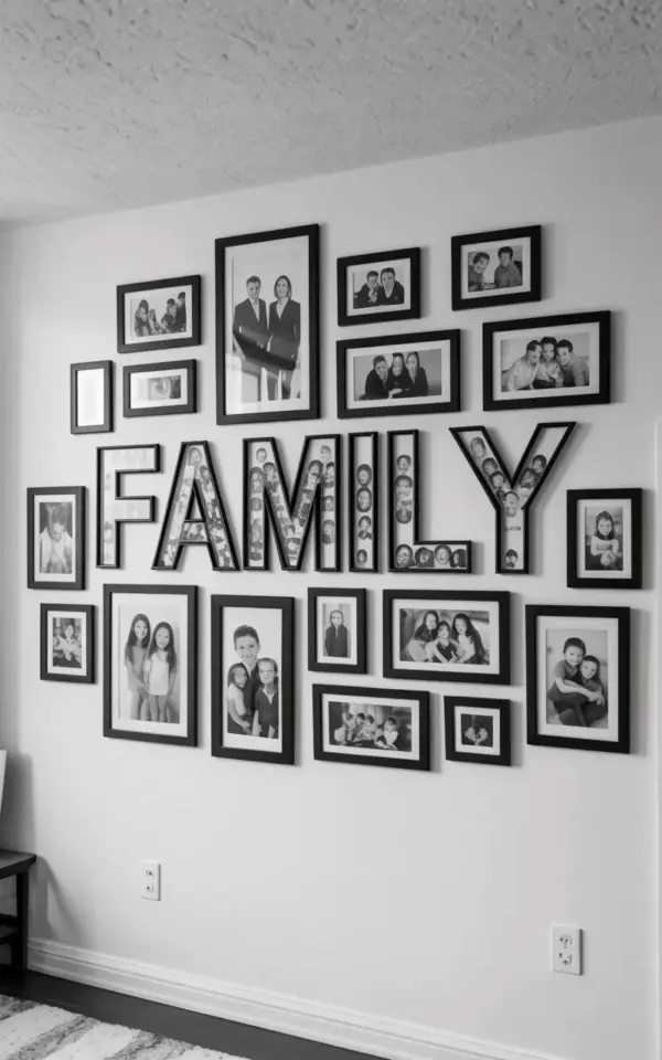
If you have ever tried to build a family gallery wall with letter frames, you already know the struggle. You pick out your favorite photos, order those chunky black frames, arrange the word “FAMILY” across the center. And then you step back and it looks weird. The letters look disconnected. Honestly, it is one of the most common family gallery wall mistakes out there, and I see it all the time on Pinterest boards and in real living rooms. The problem is almost always spacing. You put the letters too far apart and suddenly “FAMILY” reads more like “F A M I L Y” than a single word. Your eye has to hop around like a game of hopscotch, and the whole wall loses its punch. So let me walk you through why this happens and how to fix it, especially if you are planning a wall refresh this season.
Why Spacing Matters More Than You Think
Our brains are wired to recognize words as whole shapes, not individual letters. When you see “FAMILY” spelled out with a gap of six or seven inches between each letter, your brain stops treating it like a word and starts seeing five separate objects. It is like reading a sign where someone forgot to kern the font.
I remember the first time I tried this at home. I used a tape measure, carefully marked four inches between each letter frame, and was so proud. Then I sat on the couch and squinted. Something was off. It took me an hour to realize the frames themselves had thick black borders, which added visual weight between the letters. So the actual gap between the photographed areas was maybe five inches. Not great. The fix? I moved them closer, down to about two and a half inches edge to edge. That small change made the word snap into focus. Look, spacing is not just about measurement, it is about how the frames interact with the photos inside them.
The Science Behind Reading the Word ‘FAMILY’
Here is a fun little fact: When you read a word, your eyes do not scan every single letter. They take in the first letter, the last letter, and the general shape of the word, then your brain fills in the rest. That is called parallel letter recognition. For a word like “FAMILY” to read smoothly on a gallery wall, the letters need to be close enough that your peripheral vision can grab the whole shape in one glance.
If the spacing is too wide, your brain has to work harder. It goes: F… A… M… I… L… Y. Ping pong, ping pong, ping pong. Honestly, it is exhausting. And not gonna lie, it makes your wall feel scattered and unfinished. I once helped a friend fix her gallery wall, and she had her letters spaced a full six inches apart. She thought it looked “airy.” I told her it looked like the letters were avoiding each other. We tightened the gap to two inches and suddenly the whole wall felt intentional. So treat the word “FAMILY” like a single unit, not a collection of souvenirs.
How Far Is Too Far? The 2 to 3 Inch Rule
So what is the magic number? For letter frames on a family gallery wall, I recommend keeping the gap between the outer edges of each frame between two and three inches. That is close enough for the word to read as one unit but far enough to avoid your frames touching and looking cramped.
But here is the thing: that rule changes slightly depending on the size of your frames. If your letter frames are small, say 5×5 inches, you might want to go closer to 2 inches. If they are big, like 8×10 inches, 3 inches can work. And if you are using frames with really thick black borders (like the ones in the photo with black frames and white mats), account for the visual gap created by the border. The mat inside the frame might be white, so the actual photo area is smaller. Measure from the edge of the frame, not from the photo edge. Trust me, I learned this the hard way after moving my “F” three times.
- Small letter frames (5×5 or 6×6): aim for 2 inches gap between frames.
- Medium letter frames (8×8 or 8×10): 2.5 to 3 inches works well.
- Large letter frames (10×10 or bigger): 3 to 4 inches, but test it visually first.
- Thick frames: reduce the gap by half an inch to compensate for the visual bulk.
And do not forget to lay everything on the floor before you put a single nail in the wall. Seriously. I lay out all my frames on the living room rug and rearrange them for twenty minutes. My dog thinks I am playing a weird game. But it saves you from patching holes later.
Balancing Text with Photos: Size and Frame Tips
In the photo that inspired this article, you see a beautiful black and white gallery wall display. The word “FAMILY” sits across the center in individual letter frames, each containing a photograph. Surrounding the text are multiple black framed photos of different sizes. That balance is key. You do not want your word to float alone like an island. It needs context, a visual conversation with the photos around it.
Here is what I do: I choose the largest photos to flank the ends of the word. Maybe a 11×14 on the left of the ‘F’ and another on the right of the ‘Y’. Then I scatter medium and small frames above and below the letters. The black frames tie everything together. And since the letters are also in black frames, the whole wall reads as one cohesive piece. Pro tip: use photos that have similar tonal range. If your “FAMILY” frames contain black and white images, keep the surrounding photos black and white too. Mixing color and black and white can work, but it is harder to pull off. I once added a neon pink frame to a monochrome wall and it looked like a clown sneezed. Not my best moment.
Common Gallery Wall Mistakes Beyond Spacing
Spacing is the big one, but there are a few other family gallery wall mistakes that trip people up. And since we are talking about seasonal refreshes, I want to mention them while they are fresh.
- Ignoring the ceiling line. In the photo, you can see the ceiling at the top. That means the wall height matters. Do not start your gallery wall too high or too low. Aim for the center of the arrangement to be at eye level, about 57 to 60 inches from the floor.
- Using all same-sized frames. That creates a grid that looks like a yearbook. Mix sizes for a dynamic feel. The photo shows a good mix of large, medium, and small.
- Forgetting negative space. You do not need to fill every inch. Let some white wall show through. It gives the eye a place to rest.
- Not using a template. Cut out paper shapes in the sizes of your frames and tape them to the wall. Move them around until you like the layout. Then hammer the nails right through the paper. This trick changed my life. Actually, it did. I used to have a dozen tiny holes in my plaster from measuring wrong.
Seasonal Decor Twist: Refreshing Your Gallery Wall for Fall
Alright, so you have got your spacing right, your word reads as one, and your photos are balanced. Now what? This is where the seasonal angle comes in. I like to update my family gallery wall twice a year, once in spring and once in fall. For fall, I swap out a few of the surrounding photos for ones with warmer tones, pumpkins in the background, golden leaves, cozy sweaters. The letter frames with “FAMILY” stay the same, because that word is timeless, but the photos inside the letters can change too. Yes, you can swap the images inside the letter frames. It is a little fiddly but totally worth it.
One weird thing I do? I keep a small envelope labeled “seasonal gallery wall photos” with prints I have already cropped to fit the frame sizes. I do not wanna be digging through shoe boxes when the mood strikes. I just grab a print, pop it in, and done. And I always keep the spacing constant. Because if I move the letters even half an inch, the whole wall feels wrong. So I measured once, marked the nail positions with a pencil mark on the wall (a tiny dot, barely visible), and leave those marks forever. They are my secret guide. My husband thinks I am obsessive. He is not wrong.
Trust Your Eye But Measure Twice
Look, rules are helpful. The 2 to 3 inch rule works for most families. But you also have to trust your own eyes. Step back, take a photo with your phone, look at it in black and white. Does the word “FAMILY” read as a complete word? Does the wall feel balanced? If not, adjust. Move a frame half an inch closer. It is not a big deal.
I have a tendency to overthink these things. I once spent a whole Saturday rearranging three letter frames and ended up back where I started. But you know what? That afternoon taught me exactly why spacing matters so much. When you get it right, the gallery wall becomes the heart of the room. People walk in and see the word first, then the faces. It tells a story. And that story should not be interrupted by awkward gaps between letters.
So go ahead, measure, lay things out, and then take a deep breath. You have got this. And if you want to remember these tips for later, save this pin. It will be here when you are ready to tackle your own wall.
#familygallerywall #gallerywallideas #familywalldecor #gallerywallmistakes #homewallart
Leave a Comment