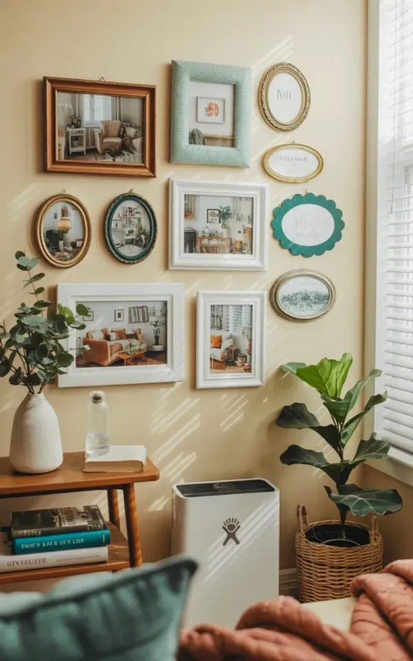
Mixing Frame Colors: Brown, Gingham, and Teal
When I put together this cozy gallery wall, I knew I wanted something that felt collected over time, not staged. That is why I grabbed a mix of vintage style frames in brown, green gingham, and teal scalloped shapes. The brown wooden frame gives a warm, grounded anchor, while the green gingham adds a subtle cottage feel. The teal scalloped one is the unexpected pop that keeps the whole arrangement from looking too predictable.
If you are working on your own wall, do not be afraid to layer different wood tones and painted finishes. A dark walnut frame next to a light, almost whitewashed one creates texture. The key is to keep the frame proportions varied. I placed the larger brown frame at the top right, balanced by the teal scalloped piece at the bottom left. This visual push and pull makes the eye travel across the whole layout.
Oval Frames Add Softness and Variety
Oval frames are a secret weapon for a vintage gallery wall. They break up all the rectangles and squares, and their curved edges feel softer against a straight wall. In this arrangement, I used several decorative oval frames, some with brass accents, others with painted wood. They hold photos of living rooms with cozy furniture and potted plants, which ties back to the natural, lived in vibe.
Look for oval frames at thrift stores or estate sales. They usually come in sets, but do not be afraid to mix a gold toned oval with a black one. The contrast will add depth. And because ovals are less common than standard rectangles, they instantly make your gallery wall feel intentional and curated, like something you found over years of hunting.
Styling With Eucalyptus for a Natural Touch
On the left side of the wall, right next to the window with white horizontal blinds, I placed a white ceramic vase holding eucalyptus branches. That simple addition softens the whole arrangement. The muted green of the eucalyptus echoes the green gingham frame and makes the brown and teal feel more grounded. Plus, eucalyptus dries beautifully, so you do not have to worry about replacing it every week.
If you want a similar look, choose a vase that has a matte finish. Glossy can compete with the frames. A plain ceramic or stoneware vase keeps the focus on the branches and the art. You can also cluster a few sprigs of dried lavender or preserved ferns for a similar effect. The natural element breaks up the straight lines of frames and blinds, giving your eye a place to rest.
Keeping It Light With a Cream Wall and White Blinds
The cream wall in this photo does a lot of the heavy lifting. It keeps the whole gallery wall feeling airy, even with all the different frame colors. White horizontal blinds next to the arrangement let in soft, diffused light. That light hits the eucalyptus and the glass of the frames, creating gentle reflections that make the space feel alive.
When you are choosing a wall color for your gallery wall, remember that pale neutrals like cream, ivory, or even a warm white make darker frames pop without looking heavy. If you have a bold wall color, you might need to stick with all black or white frames to avoid visual chaos. But on a cream wall, you can get away with mixing brown, green, teal, and even a little gold.
Choosing the Right Art: Interior Scenes and Plants
Notice how the framed photographs in this wall all show interior scenes of living rooms with furniture and plants. That is a smart choice. By keeping the subject matter consistent (cozy rooms), the disparate frames feel unified. Your eye jumps from frame to frame, but the content has a thread that ties it together.
For your own gallery wall, think about a theme. It could be black and white photos of windows, botanical prints, or even postcards from your travels. The idea is to create a visual rhythm. Here is a quick list of art themes that work well with vintage frames:
- Botanical illustrations or pressed flower art
- Black and white architecture shots
- Vintage travel posters with muted colors
- Personal photographs with similar lighting or composition
- Abstract watercolors in soft earth tones
Stick to one theme and you can mix frame styles without the wall feeling messy.
Hanging Tips for a Cozy Gallery Layout
Before you hammer any nails, lay your frames out on the floor. I always do this near the actual wall so I can see the proportions. Start with the largest piece (in my case, the brown wooden frame) and build outward. Leave about two to three inches between each frame. That spacing keeps the collection looking cohesive without being crowded.
Use paper templates cut to the size of each frame. Tape them on the wall and step back to adjust. Move the oval frames around until the curves balance the rectangles. I also like to hang the ceramic vase and eucalyptus slightly separate from the frames, so it feels like part of the scene but not squished in. A level is your best friend, even for a casual, collected look. Nobody wants a frame tilted just enough to bug you forever.
Once everything is hung, stand back and look at it from different spots in the room. You might find that moving the teal scalloped frame down an inch makes a big difference. Trust your gut. Gallery walls are meant to feel personal, not perfect.
Final Thoughts and a Soft Call to Action
A cozy gallery wall with vintage frames and eucalyptus is one of those projects that brings a room together without a huge overhaul. You do not need expensive art or professional styling. Mix a few thrifted frames, add some dried branches, and let the cream wall do the work. The best part is that you can swap out photos or add frames over time. It grows with you.
If you are planning your own gallery wall soon, pull a few frames from your stash or hit a local flea market. Play with the layout on the floor, grab a bundle of eucalyptus, and start hanging. I would love to hear what combination you come up with. Drop a comment or save this post to your home decor board for when you are ready to start.
#gallerywall #vintageframes #homedecor #wallart #cozyhome
Leave a Comment