The problem with most DIY gallery walls isn’t the frames, the photos, or even the layout. It’s the invisible grid. I spent a whole Saturday afternoon hanging my polaroid collection in the hallway, using a laser level and a tape measure with military precision, and the result looked like a waiting room at a dentist’s office. Every frame was perfectly aligned, the spacing was mathematically identical, and the whole thing felt stiff and boring. It wasn’t until I tore it all down and started over that I understood the real secret to a hallway wall that feels collected.
What actually worked was breaking every rule I thought I knew. I stopped measuring and started trusting my eye, mixing heights, sizes, and orientations until the arrangement felt balanced. The difference was night and day. This is the story of that second attempt, and the specific mistakes I made so you don’t have to repeat them.
## Why Picture Perfect Spacing Ruins a Gallery Wall
There’s this instinct to make everything neat, to place your frames with equal gaps between them like a row of soldiers standing at attention. I get it. I did the exact same thing with my first attempt. I measured 3 inches between every single frame, and the result was a wall that looked sterile. It didn’t tell a story, it just sat there looking correct.
The issue is that our eyes naturally connect things that are evenly spaced. So instead of seeing individual memories, you see one flat, unbroken mass of rectangles. You lose the charm of the individual photos and the character of each frame. A collected look, on the other hand, has a rhythm. It feels alive because it has variation: a big frame next to a tiny one, a landscape orientation next to a portrait. Honestly, it feels like your life, not a showroom.
## Gather Your Mix of Frames Before You Touch the Wall
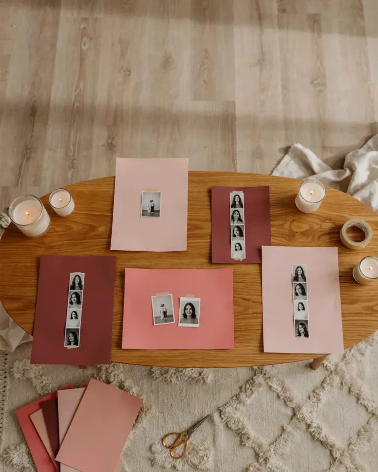
Before you hang anything, spread every frame, print, and object you want to use on the floor. This is your staging area. I used the living room rug, much to the annoyance of my cat, who immediately claimed a spot in the middle of my carefully arranged polaroids. But here’s the thing: seeing them all together on the floor is the only way to start building a composition that isn’t boring. It gives you the big picture, no pun intended, before you commit to hammering nails into your hallway wall.
You don’t need a matching set. I used a mix of black frames, a couple of brass ones, and one very chunky white wooden frame that my sister gave me. I also threw in a small vintage mirror I found at a flea market. A mirror breaks up the photo grid and adds depth. Stick to a cohesive color palette for the frames if you can, because that will prevent the wall from looking chaotic. But the sizes? Those should vary wildly. You want a big statement piece, a few mediums, and some tiny, surprising ones mixed in.
## How to Mix Frame Sizes and Heights Without Making a Mess
Ok so here is where the actual magic happened. Instead of measuring the distance between frames, I focused on the negative space around each piece. I started by hanging my largest frame off-center, not in the middle of the wall, because that instantly made the layout feel more dynamic. Then I worked outward from there, balancing its weight with a cluster of three smaller polaroids on the opposite side.
The critical part was varying the vertical heights of the frames. I hung some higher, some lower, creating a gentle flowing wave across the wall. There is a line, usually around eye level, that you want to keep in mind, but that doesn’t mean every frame needs to sit on that line. In fact, they shouldn’t. Let some frames dip below the line and let others rise above it. The goal is to achieve balance, not symmetry. You want the eye to travel around the arrangement, pausing at each photo, not slide monotonously from left to right.
## Hallway Wall Ideas That Look Collected, Not Curated
– Use a gallery wall to display non-photo items: pressed leaves in a small glass frame, a child’s drawing, a ticket stub from a concert.
– Add one oversized piece to anchor the entire wall, it gives the smaller pieces a home base.
– Overlap the edges of a couple of frames slightly. This adds serious depth and makes the wall feel casual.
– Use paper templates cut to the exact size of your frames to test layouts on the wall before hammering a single nail. I used wrapping paper and it saved my wall from a hundred unnecessary holes.
– Leave one frame slightly tilted. Just a couple of degrees. It sounds weird, but it makes the whole wall feel instantly relaxed and intentional.
The polaroids I hung are mostly black and white, which gives the collection a consistent feel even though the frames are all different. I also added a few small watercolor sketches my friend painted. Mixing art mediums is a huge flex for the hallway. It makes the wall look like it was collected over years, even if you put it all up in a single afternoon. Nobody has to know your secret.
## The Biggest Mistake I Will Never Make Again
I keep coming back to the spacing because it was truly the biggest mistake of my first attempt. I was so obsessed with the idea that a gallery wall had to be neat and orderly that I sucked all the personality out of it. My husband walked past my first attempt and said, “Did you hang those with a level?” and it was not a compliment. He couldn’t point to any one piece because they all blended together into one uniform blob.
When I redid it, I stopped obsessing. I put the level back in the drawer. I hung the frames with a rough measuring tape and a lot of stepping back to check the look. The result was a hundred times better. People actually stop to look at the polaroids now. The wall invites you to come closer, to see the different frames and the stories behind them. That is what you actually want from a gallery wall. Not just a decoration, but a conversation starter.
## A Few Final Details to Get the Balance Right
As you build the wall, take a photo of it with your phone. Looking at a flat image helps you spot imbalance that your eyes miss in 3D. I saw that I had too much weight on the left side and was able to swap a large frame for a smaller one before the wall was fully done. Work in stages too. You don’t have to fill the entire hallway wall in one day. I hung a third of my polaroids, lived with it for a week, and then added more.
That pause is important. It lets you figure out if the flow feels right. If you rush, you risk creating a cluttered mess instead of a collected display. Slow down. Leave some empty wall space. A gallery wall needs breathing room, negative space around it. Do not let it touch the top of the baseboard or the ceiling. Give it a border of blank wall around the edges to frame the look.
One more thing, and this is the odd hyper-specific detail, when I was rearranging my polaroids, I realized I had accidentally hung one of them upside down. I left it. It is a photo of a beach at sunrise, and honestly, the reflection in the water looks cool reversed. It is my favorite frame on the whole wall because it reminds me that this wall is not about perfection. It is about memories and how we choose to see them.
The hallway wall transforms from a boring passageway into a gallery. You walk past it every single day, and it actually makes you happy. It is the last thing I look at before I leave the house and the first thing I see when I come back. That is the power of a gallery wall done right, with all its quirks, eccentricities, and imperfect, human spacing.
Take your time, lay everything out on the floor, and trust your gut over the measuring tape. If the arrangement feels good to you, that is all that matters. Now, go raid your drawer of random frames and start playing with layouts on the floor. Your hallway wall is waiting for a little life.
Leave a Comment