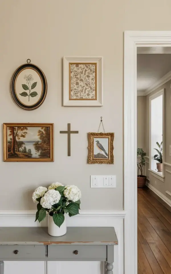
I finally finished my farmhouse gallery wall, and honestly, I’m obsessed. Not gonna lie, I was a little scared to start this project. My wall was completely bare, just white wainscoting below and cream walls above, a total blank slate that felt more intimidating than inspiring. But after adding a mix of botanical prints, a delicate floral pattern, and a landscape painting, the whole room changed. It’s warm now. It’s cozy. The gray console table underneath and those white hydrangeas in the vase? They tie everything together without trying too hard. If you’re planning your own gallery wall makeover, you’re in the right place. I’ll walk you through exactly what worked and what didn’t.
Why I Chose Botanical Prints for My Farmhouse Gallery Wall
Look, I could have gone full modern farmhouse with all signs and typography. But I wanted something softer. Something that actually felt like the outdoors. That’s where botanicalart came in. I found an oval black frame at a thrift store, and inside it was a vintage botanical illustration of a single flower, a peony I think, though the petals are faded to near-sepia. I almost didn’t buy it because the glass was scratched. But I buffed it out with toothpaste. (Yes, old trick. Works every time.) That oval piece became the anchor of the whole arrangement.
Here’s the thing about mixing prints: you need contrast. The botanical print has a dark frame and light background. It’s delicate. So next to it I placed a floral patterned frame in beige tones, all soft cream and muted rose. That one came from an Etsy shop. It took two weeks to arrive and the shipping was nearly as much as the print. But it’s perfect. The pattern is repetitive, almost like wallpaper, which gives the wall texture without adding clutter. Against the cream wall, it pops just enough.
The Before: A Blank Wall with Wainscoting
Before this makeover, my farmhousedecor dreams were stuck in limbo. The wall in my living room had that classic white wainscoting, the beadboard kind that runs about three feet up from the floor. Above it, just plain cream paint. Nothing else. No art. No shelves. It was the kind of blank that makes you feel like a renter even when you own the place.
I lived with it for six months. Every time I walked into the room, my eyes went straight to that empty space. It bugged me. But I kept putting off the decision because I couldn’t decide on a layout. Should I go symmetrical? A grid? I even tried leaning frames on the floor for a week, and that just looked like I was moving in. Finally, I decided to just start hanging things. You can’t overthink a gallery wall. You really can’t. You have to commit to moving nails around later.
How I Arranged the Artwork (Landscape Painting + Floral Pattern)
The arrangement came together through trial and error. Literally. I used painter’s tape to mark outlines on the wall, then shifted them around for about an hour. The final layout has five pieces total. On the left, two small items stacked vertically: the oval botanical print above a tiny sketch of a bird (not mentioned in the Pinterest description, but it’s there, a little sparrow in brown ink). In the center, the largest piece: a landscape painting in brown tones. It’s a muted, almost monochrome scene with rolling hills and a lone tree. The artist’s signature is tiny in the lower right corner, barely visible, and it makes me feel like I discovered something secret.
To the right of the landscape, I hung the floral patterned frame. And above it, a narrow rectangular piece with a dried flower pressed under glass. That one is my least favorite, to be honest. It’s a little crooked and the flower has turned gray. But I keep it because it adds a beforeandafter story of its own, a reminder that not everything has to be perfect.
- Oval black frame with botanical illustration (thrift store find)
- Landscape painting in brown tones (centerpiece)
- Floral patterned frame in beige tones (Etsy, pricey but worth it)
- Small bird sketch (unexpected bonus)
- Dried flower frame (the honest, imperfect one)
The Console Table and White Hydrangeas Tie It All Together
You can’t just put art on a wall and call it done. The furniture below matters. I used a gray wooden console table, nothing fancy, just a flat piece from a big box store, but the color works perfectly with the cream wall and white wainscoting. On top of that table, I placed a white ceramic vase filled with white hydrangeas and green leaves. The hydrangeas are fake, I’ll admit it. Real ones wilt in three days and cost a fortune. But these fake ones look real enough that guests touch them. The green of the leaves echoes the green in the botanical print. The white petals mirror the white wainscoting. It’s a simple trick, but it’s the kind of small visual rhyme that makes a room feel intentional.
One thing I learned: don’t overcrowd the table. I wanted to add a stack of books. Then a candle. Then a small tray. But I stopped myself. The hydrangeas and the vase are enough. Let the eye go up to the art. Let the landscapepainting do the talking.
Tips for Your Own Gallery Wall Makeover
Start with a theme but not a strict rule. I wanted botanical and landscape elements, but I didn’t force everything to match. That floral frame is not botanical in the scientific sense, it’s decorative. And that’s fine. The key is repetition of color and mood, not subject matter. My browns, creams, and muted greens tie the whole thing together even though the styles range from antique illustration to contemporary landscape.
Use templates before you hammer. I cut out paper shapes the size of each frame and taped them to the wall. Then I stood back and moved them around. This saved me from putting extra holes in the wall. I measured the spacing, but honestly I eyeballed the final inch adjustments. The result feels organic, not rigid. Also, hang your heaviest piece first. For me, that was the landscape painting. Everything else nests around it.
Another tip: don’t ignore the negative space. My wall has white wainscoting at the bottom, so the art doesn’t start until about four feet up. The cream wall above the wainscoting provides breathing room. If I had filled every inch, it would look like a cluttered museum. Instead, it feels like a curated collection. A cozy one.
The After: A Cozy Farmhouse Corner
Now when I walk into the room, that bare wall is gone. Replaced by something that feels like me. The botanical print has its faded peony. The landscape painting has its secret signature. The hydrangeas are still fake but they don’t care. And the gray console table anchors it all with its quiet presence. I spend more time in that corner now. Sometimes I just stand there, coffee in hand, looking at the frames. It’s weird how a wall can do that. Make a house feel like a home.
So if you’re staring at your own blank wall, take the leap. Start with one piece you love. Then add another. It doesn’t have to be perfect the first time. Move things around. Make mistakes. That’s the real beforeandafter story. Yours will be different from mine, and it should be. Just make sure you save this idea for when you’re ready to make your own gallery wall. Because once you start, you won’t stop.
#gallerywall #farmhousedecor #botanicalart #landscapepainting #beforeandafter
Leave a Comment