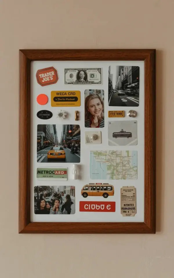
The glow from a subway map in a dark room, a scratched MetroCard that still holds a little bit of the New York grime, a black and white shot of a brownstone that you took on a rainy morning. You have these bits and pieces living in a shoebox somewhere, and honestly, it’s a shame. This specific travel memory frame idea, using vintage city photos and a MetroCard, is one of my favorite ways to stop letting those paper souvenirs fade into nothing. I have built more of these than I can count, and the one hanging on my wall right now is a perfect example of what to do, so let’s talk about the mistakes I made getting there.
Look, when you search for inspiration online, everyone shows you the perfect “after” shot. They rarely show you the pile of crooked labels and wrinkled dollar bills that ended up in the trash. I want to be the friend who tells you the truth about the process, so you can skip the frustrating parts entirely. This guide is built around the common mistakes I have made (and seen others make) when assembling a memory collage, so you can get to the finished piece faster.
### Mistake 1: Choosing the Wrong Background Paper
Often, people rush to their craft drawer and grab whatever scrapbook paper is on top. That is a huge error. If your background is too busy, it will fight with the souvenirs for attention, and the collage will look chaotic, not curated. The photo that inspired this entire project uses a crisp white background, and that is exactly why every single item pops so beautifully.
I tested a cream-colored paper once, thinking it would look “vintage,” but it just made the white in my photos look dingy. Stick to a bright, clean white cardstock for this particular idea. It gives the dark wooden frame a sharp contrast and makes the black and white photos look incredibly striking, like they are floating in a museum gallery rather than stuck to a piece of paper.
### Mistake 2: Overlooking the Value of Odd Little Stickers
Do not underestimate the power of a random sticker. In the collage we are referencing, there is a bright red circular sticker and a tiny “crumb” label holding things together. These small elements are not filler; they are the glue, both literally and visually, that makes the arrangement feel cohesive.
Here is the thing: if you stick everything down with tape, it looks like a kindergarten project. Using actual stickers or washi tape as your adhesive adds a layer of intent to the design. Plus, if you have a Trader Joe’s logo sticker (which apparently I saved from a grocery run three years ago), it adds that quirky, human element that makes the frame feel personal instead of store-bought.
### Mistake 3: The “Let’s Put Everything In” Trap
When you are sorting through your city trip mementos, you will want to include every single ticket stub and business card you touched. Do not do it. Overcrowding is the fastest way to ruin this specific style. The beauty of this white-space frame is the breathing room.
– Pick one main focal point (for me, it was the MetroCard).
– Choose one secondary item with text (like the Trader Joe’s sticker or the “crumb” label).
– Limit yourself to two or three photos maximum (the vintage bus illustration counts as one).
– Edit ruthlessly. If it does not fit the color story of black, white, and warm red, leave it out.
### Mistake 4: Forcing a Regular Frame to Do the Job
This might sound picky, but the depth of the frame matters. A cheap, flimsy frame from the drugstore usually has a thin profile that makes a collage look flat. You want a dark wooden frame with some weight to it, something that feels substantial against a beige wall. It anchors the entire display.
I once used a white frame thinking it would be neutral, but it washed out the white paper. The dark brown wood frame provides a necessary border, a visual “stop” that keeps the eye focused on the center. It also adds that specific masculine, library-like warmth that contrasts nicely with the delicate nature of old paper. This is a detail you will feel once you hang it up.
### Mistake 5: Gluing Down Photos Without a Dry Run
This is a common mistake because we are all excited to see the result quickly. But the moment you press that vintage bus photograph down onto the white paper, there is no turning back. Ink bleeds, dollar bills wrinkle, and paper tears if you try to peel it up.
Arrange everything on the white paper first. Step back. Look at it from across the room. Wait a few minutes, make a cup of coffee, and look again. Rearrange the layout three or four times if you have to. Once you are happy with the spacing between the MetroCard and the map, only then should you start adhering things down, starting with the photos first and building the smaller items around them.
### Mistake 6: Ignoring the Physical Texture of the Money
Here is a specific detail that most people miss: money is not flat. A dollar bill has a distinct texture, and if you do not flatten it out, it will cast a lumpy shadow under the glass. Run your fingernail along the edges of the bill a few times, or press it under a heavy book for a week before you start. In the photo, the dollar bill is slightly crumpled, which adds character, but it is still pressed flat enough to not look sloppy under the glass. You want the fiber of the paper to show, but you do not want actual wrinkles that distort the print.
### Mistake 7: Hanging the Frame Too High
Once the frame is assembled, the work is not done. I cannot tell you how many beautiful gallery walls I have seen that are hung too high to actually enjoy. If you are placing this in a hallway, do not hang it right under the ceiling. For a collage like this, the center of the frame should be at or slightly below eye level. That way, you can actually lean in and inspect the little “crumb” label or read the tiny text on the map.
The goal is to catch someone’s attention and force them to step closer to look at the details. If it is hung near the ceiling, it just becomes a blur of dark wood and white paper. And if you are mixing it into a larger gallery wall, group it with something with a contrasting shape, like a round mirror, to break up the hard lines.
### Wrapping Up Your Memory Frame Session
The finished piece, with its dark frame and story-filled white center, is more than just wall decor. It is a physical archive of a specific time in your life, a way to keep those city trip mementos together without them sitting in a junk drawer. It turns the mundane, like a subway pass or a grocery sticker, into artifacts.
Making this collage is a surprisingly meditative process. Once you step away from the perfectionism and start embracing the slight crumples and faded inks, you will end up with something that sparks joy for years. So, dig through those drawers, grab some white paper, and see what story your paper collection tells. Have you kept anything weird from your last vacation? I would bet it belongs in a frame like this.
Leave a Comment