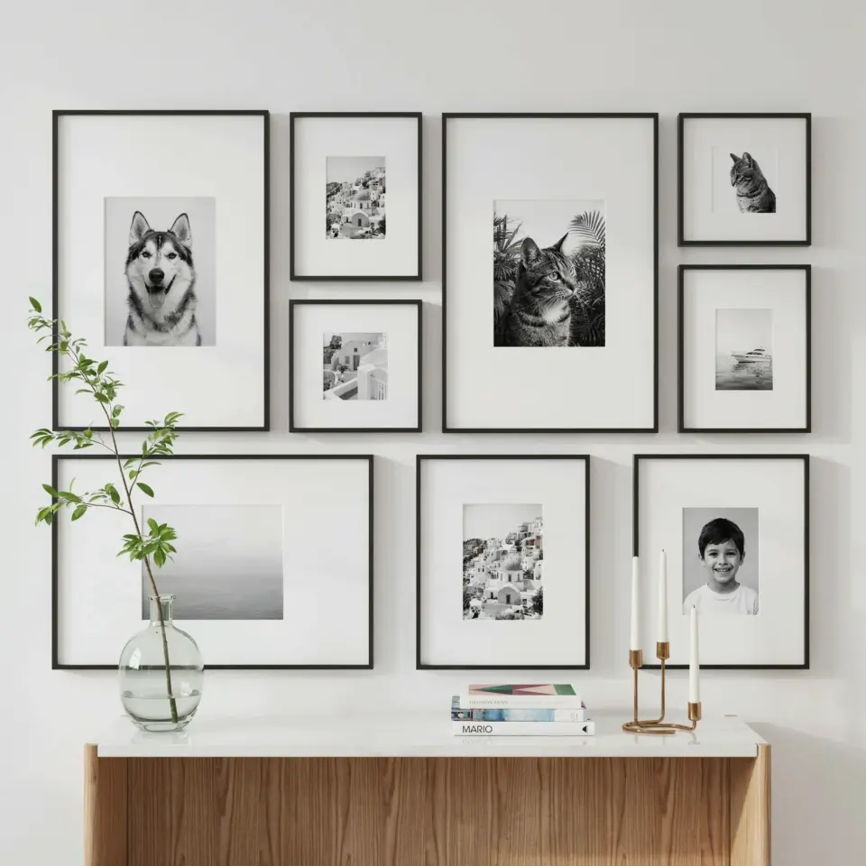
I finally tackled my gallery wall before and after project, and honestly, my living room went from a sad empty rectangle to a space I actually want to hang out in. The secret weapon? Multi-mat frames. You know the kind with that extra thin border inside the mat, the ones that make even a five-dollar print look like it belongs in a museum. Ok so here’s the thing. I had zero art experience. I just picked a weekend, bought a pile of frames, and started stacking. Let me walk you through exactly how I did it, because if I can figure this out, you definitely can.
Why I Chose Multi-Mat Frames Over Everything Else
I’ve always been suspicious of those cheap poster frames with the flimsy paper backing. They never look right. Multi-mat frames, the ones with a double or triple mat inside, give you that professional breathing room around your artwork. The extra border creates depth. It makes a simple photograph or print feel important.
Here’s the real reason I went this route. I wanted a cohesive look without buying all matching frames. With multi-mats, the white mat acts as a neutral bridge between different frame colors and sizes. So I mixed black, wood, and even a silver one. The white mat tied them together like magic.
Look, I’m not a decorator. I’m a person who got tired of staring at a blank gray wall. The multi-mat approach gave me instant sophistication without spending a thousand dollars on custom framing. That’s a win in my book.
The Before: A Blank Wall That Made Me Sad
My living room wall measured about ten feet wide. Before this project, it featured nothing but a single lonely outlet and a patch where the previous owner’s TV mount used to be. Not gonna lie, it felt like the room was missing a soul.
Every time I walked in, the emptiness bothered me. I tried a big mirror once. It looked like a dressing room. I tried a single large canvas. Too lonely. The wall needed energy, variety, something that said “someone thoughtful lives here.” That’s when I started hoarding frames from thrift stores and clearance bins.
Planning the Layout Without Losing My Mind
This step almost broke me. Actually no, it did break me once. I had a whole pile of frames on the floor and no clue how to arrange them. Then I remembered a trick from a friend who hangs art in galleries.
I cut out pieces of craft paper the exact size of each frame. Then I taped them to the wall. That way I could move the mock-ups around, step back, stare at them, and change my mind a hundred times without drilling a single hole. Here are the rules I followed for a clean look:
- Start with the largest frame in the center or slightly off-center. I used a 16×20 inch piece with a triple mat.
- Work outward with medium frames about 5 to 8 inches apart. Keep gaps consistent, but not robotically identical.
- Fill the gaps with tiny frames, maybe 4×6 or 5×7. I hung one tiny engagement photo near the bottom right, just for a personal touch.
- Check the overall shape. I aimed for an organic rectangle, not a perfect grid. A slight irregularity looks curated, not chaotic.
One weird thing I learned. My smallest frame was a 3×5 with a huge mat. That tiny piece anchored a corner that felt empty. Never underestimate the power of a small thing with generous matting.
Hanging the Frames: My Weekend Workflow
I chose a Saturday morning when the light was good. I had my mock-up paper still taped up, my hammer, a level, and picture-hanging hooks. I also had a roll of painter’s tape for marking nail positions.
The trick is to hang the first frame and then use it as a reference for the rest. I hung my largest piece first. Then I measured from its bottom edge to decide where the next frame’s top should go. I used the paper mock-up as a template to mark the nail spot exactly through the tape.
For heavy frames, I used wall anchors. For smaller ones, just a simple nail. I cannot stress this enough: use a level every single time. Even a half-degree tilt will drive you crazy later. I leaned one frame slightly on purpose for an artsy feel, but the rest are dead level.
The After: What Made This Dream Wall Work
Stepping back after the last frame was hung felt incredible. The wall had texture, history, and color. But the cohesive look came from those white mats. Every piece, no matter how random, shared that same white border. It unified the chaos.
Also, mixing frame styles helped. I had one thick dark wood, two thin black metal, and a weathered gold one from a garage sale. With the multi-mats, they all became cousins. I also repeated a few prints. I used two identical line-art black and white prints in different sizes, one above the other. That repetition became a subtle rhythm in the layout.
And you know what? I left a few tiny gaps on purpose. Not every inch of wall needs to be covered. Negative space lets the eye rest. My wall breathes.
My Best Multi-Mat Frame Shopping Advice
If you want to replicate this, start cheap. Thrift stores often have multi-mat frames for five bucks with the artwork still inside. Just take out the print and swap in your own. I found a frame with a hideous flower print but a gorgeous triple mat. That mat alone was worth it.
Online, search for “frame with double mat” or “museum mat frame.” Don’t pay full retail for new unless you’re after a specific color. And here’s a pro tip. If you buy frames without mats, you can buy pre-cut matboard separately. It’s cheaper and you get to pick the exact opening size. Just measure your art first. I learned that the hard way when I ordered a mat with an opening too small for my print. I had to cut it myself with a hobby knife, which looked awful. Do not recommend.
Another personal thing. I absolutely hate when the mat is slightly off-white. Make sure all your mats are the same shade of white. A warm white next to a cool white looks sloppy. I bought one off-white mat by accident from a discount bin. I had to re-buy it in true white. Waste of five dollars, but my wall thanks me.
A Few Random Mistakes You Should Avoid
I hung my first frame too high. Classic error. The center of the gallery wall should be at eye level, around 57 to 60 inches from the floor. Not the center of each frame, but the center of the entire arrangement.
Also, I used too many tiny frames at first. It looked busy, like a cluttered bulletin board. I removed three small ones and the wall instantly looked more intentional. Less is more, even in a gallery wall.
And finally, I forgot to account for the depth of the multi-mats. Some of my frames had thick mats that cast a shadow. That’s actually a cool effect, but be aware of it when spacing. A thick mat needs a bit more breathing room from the frame next to it.
So there you have it. My gallery wall before and after turned a depressing living room into something I actually enjoy looking at. The multi-mat frames did the heavy lifting for me. I just had to show up, measure twice, and commit to the layout. If your wall needs a glow up, start collecting those frames. You will be surprised how quickly it comes together.
Got a blank wall bothering you? Grab a tape measure and start shopping. I would love to hear what you end up doing, seriously. Drop a comment or tag me in your own gallery wall pics. Let’s turn those sad walls into conversation starters.
#gallerywall #beforeandafter #multimatframes #diyhomedecor #wallartinspo
Leave a Comment