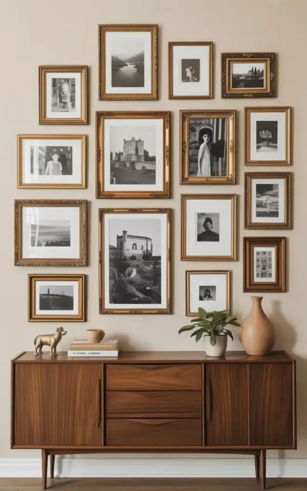
A beige wall. A cardboard box full of mismatched frames. That was the entire starting point for this gallery wall before and after, and honestly, I wasn’t sure it was going to work. I had been staring at the empty space above my console table for weeks, and the pile of vintage frames had just been sitting in the corner, gathering dust. But once I committed to the asymmetrical layout and a strict black and white color palette, the whole thing finally snapped into focus.
Look, there are thousands of perfectly symmetrical gallery walls out there. They look like they were measured by a laser and hung by a robot. That’s fine. But I wanted something with a little more soul. I wanted it to feel like it had been collected over time, piece by piece, even if I was just pulling it together over a single weekend. The anchor for this whole design became a large, slightly faded castle print, and everything else just had to fall in line around it.
### Why the Asymmetrical Gallery Wall Layout Wins Over a Grid
Here’s the thing about a grid layout. It demands perfect spacing. If one frame is half an inch off, the whole thing looks like a mistake. An asymmetrical arrangement, on the other hand, gives you total freedom. You are balancing visual weight instead of straight lines, and honestly, it is way more forgiving for a human being with a hammer and a shaky ladder.
The trick to making asymmetry work is to think about the overall shape of the arrangement. You are not just hanging pictures; you are creating a single blob of visual interest on the wall. If the big castle print is on the left, you need a cluster of smaller frames on the right to balance it out. You are aiming for a feeling of equilibrium, not a mirrored reflection. It is a completely different way of looking at the wall, and once it clicks, it is actually more fun than planning a perfectly straight grid.
### Choosing Black and White Photos That Tell a Story
Once I decided on the art, the hardest part was narrowing down the 15 pieces. I had a random stack of old family photos, but they didn’t feel cohesive enough. I knew the black and white theme was the glue, but I needed to vary the subject matter to keep the eye moving.
I settled on a mix of three distinct types of imagery:
– **Architectural scenes:** Think old European doorways, cobblestone streets, and iron bridges. These give the wall a sense of structure.
– **Landscape shots:** The large castle photo is the star here, but I included a couple of moody forest and coastline images to soften things up.
– **Portrait photography:** A couple of faded, unknown faces looking away from the camera. They add that mysterious, vintage feel.
The subject variety makes a huge difference. If all 15 pieces were landscapes, it would just look like a nature catalog exploded on the wall. The mix makes it feel like a curated collection, or at least a very interesting attic find.
### How to Mix Gold and Wood Frames Without Looking Chaotic
This was the part I was most nervous about. I had ornate, antique gold frames next to super simple, dark wooden ones, and I was terrified it would just look like a jumble. The trick, I discovered, is to establish a ratio. I used roughly 60% wood and 40% gold, which stopped the gold from looking too flashy and kept the wood from feeling too heavy.
Don’t overthink the finishing, either. A little wear and tear on the frames is a good thing. I actually love the chipped gilding on one of my ornate gold frames because it catches the light differently. The contrast between the refined gold and the rustic wood gives the wall a collected-over-time look.
### Hanging 15 Different Frame Sizes on a Beige Wall
Ok so, the actual hanging process. Let’s just say it involved a lot of blue painter’s tape, some kraft paper, and a good amount of grumbling. My wall is a warm beige, which is a great neutral backdrop, but it doesn’t offer any visual guidance. You aren’t working with white wainscoting or a dark accent wall; the beige just lets the frames pop, which is exactly what you want.
Here is the practical method that saved my sanity: trace each frame on paper, cut the shapes out, and tape them to the wall to test the layout. You can shuffle the paper around for an hour without putting a single nail in the wall. That’s how I found the sweet spot. The castle print went in the center-left, and I arranged the paper cutouts around it until the spacing looked intentional but not rigid. Vary the gaps, by the way. A two-inch gap next to a four-inch gap looks way more organic than trying to keep everything perfectly equidistant.
### The “Before” Photo: An Empty Beige Wall in Need of Personality
I wish I had taken a better “before” picture. The plain beige wall just looked so sterile, so untouched. It had that sad, waiting-room quality that perfectly blank spaces often have. You know, the kind of wall that just makes the room feel unfinished and quiet in a bad way.
The “after” is a completely different story. The room now has a central focal point that draws you in. The mix of 15 different frames instantly adds layers of texture and history, even though most of the art is from a flea market and a bunch of thrift stores. It’s amazing how much personality a single wall can hold once you stop trying to make it perfect and just start filling it with things you love.
### What I Learned About Vintage Frames and Castle Art
One thing I learned is that you should never judge a frame by its artwork. I bought a horrible, ugly butterfly print in a gorgeous, heavy brass frame. I just took the print out and put one of my black and white photos in its place. That is the secret to collecting vintage frames. Look at the bones of the frame first.
The castle print as the anchor was the right call. Because it is the largest piece, it instantly grounds the entire arrangement. Everything else just becomes a supporting actor. If I had used a small picture as the anchor, the whole composition would have felt scattered. You need that one heavyweight champion to hold the corner of the design down.
### Final Thoughts on Building Your Own Vintage Gallery Wall
This project took me about two hours from start to finish, not counting the month I spent procrastinating. It is easily the most impactful change I have made to my living room. The best part is, I didn’t buy a single new item. It was all done with stuff I already had or found for a few dollars.
If your hallway or living room is feeling a little too beige and a little too quiet, maybe it’s time to dig out your own pile of frames. Start stacking, start arranging, and do not be afraid to make a mess. You will be surprised what a little asymmetry and a whole lot of black and white ink can do. Ready to tackle your own wall? Let me know what you decide to hang first.
Leave a Comment