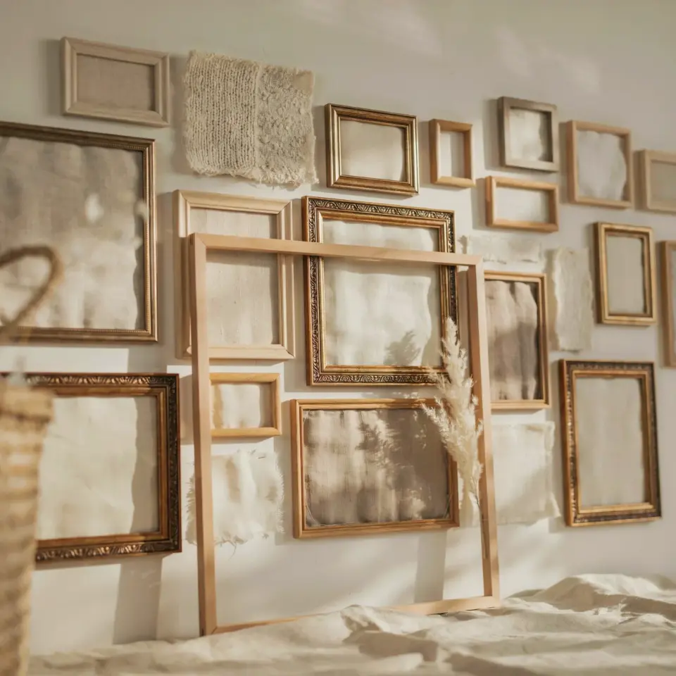
I finally hung my gallery wall frame set and honestly, the change is ridiculous in the best way. Before, that wall was just there. A big blank rectangle collecting dust and bad lighting. Now it’s this cozy vintage corner that makes me want to sit and stare at it with a mug of tea. And the best part? Every single frame came from different flea markets, estate sales, and one weird booth at a church rummage sale. (The woman running that booth gave me a discount because she said I looked like her niece. I don’t even know what that means. Anyway, I got a brass frame for three dollars.)
If you’re staring at a bare wall in your own home, wondering what to do, this post walks you through exactly what happened here. Not some perfectly staged influencer shoot. Real wall, real thrifted frames, real before and after. And yes, that off-white paint still has a smudge near the baseboard that I keep meaning to fix.
Why a Gallery Wall Frame Set Works So Well for Bare Walls
Here’s the thing about blank walls. They don’t have to stay blank. But throwing up one tiny poster looks like an afterthought. A gallery wall frame set, even a small one, gives the whole room a focal point. It draws your eye somewhere intentional. And with vintage frames, each one has its own story. That’s something a store-bought set can’t fake.
I’m not saying you need to replicate my exact layout. But the principle is solid: a cluster of frames fills negative space without making the room feel overcrowded. It’s like a conversation. The frames talk to each other. The wall listens. (I know that sounds pretentious. I don’t care. It’s true.)
Look, you could spend a lot of money on a single oversized piece of art. You could. But a set of vintage frames gives you flexibility. You can swap out photos, add a dried flower, change the matting. It evolves. That’s why I love using picture frames that already have a patina. They make the arrangement look collected over time, not curated in one afternoon.
How I Chose My Vintage Picture Frames for a Cohesive Look
I didn’t plan this. Not at all. I picked up frames here and there over six months. Some were gold, some were dark wood, one was painted a faded celery green. (Why celery? No idea. It was a dollar and I grabbed it.) But when I laid them all out, they actually worked. How? A few rules emerged as I went.
Rule one: stick to similar color tones in the frame finish. Not the same finish, but the same temperature. Mine are all warm, brass, walnut, that weird green that reads as vintage khaki. No cool silver or stark black. That would break the vibe.
Rule two: mix shapes and sizes. Two squares, a tall rectangle, a tiny oval, and a big chunky rectangle. If you have all the same shape, the wall looks like a grid at the DMV. Boring. You want some asymmetry. A little chaos that somehow resolves.
Rule three: keep the matting consistent. I used all cream or off-white mats, even though the frames are different. That visual white space ties them together. Plus, it makes the artwork pop. (I keep saying “artwork” because one frame holds a postcard of a cat wearing a bonnet. Look, it’s vintage. I stand by it.)
The Before: A Blank Wall That Needed Personality
You want the truth? That wall was depressing. It faced the door, so it was the first thing you saw when you walked in. And it was just… flat. Beige-ish paint that the previous owners left. I painted it a soft warm cream, which helped. But cream is still blank. It still said nothing.
Before the gallery wall frame set went up, I tried hanging a mirror there. Felt like a hotel bathroom. Then a single large print. Too lonely. This wall needed company. A huddle of frames, if you will.
I remember standing there one Sunday afternoon with a stack of frames on the couch. I taped up newspaper cutouts in different sizes to test layouts. (Pro tip: use painters tape so you don’t peel the paint.) That trial and error was the longest part of the whole process. But it saved me from hammering holes in the wrong spots. So worth it.
The After: How Framed Art Transformed the Room
Now the wall has texture. Depth. The frames cast tiny shadows depending on where the light hits. The room feels layered, like it has history. People who visit stop and look at each frame. They ask where I got them. They point at the cat postcard and laugh. That’s exactly what I wanted: a conversation starter, not dead decor.
Here’s a hyper-specific before and after detail: before, the room had no warmth. It was clean but cold. After, the dark wood and brass tones bring a cozy fall vibe. I even swapped out one photo for a pressed maple leaf in early October. The frame allowed that seasonal change. With a standard print, I’d be stuck.
Honestly, the difference between a blank wall and a gallery wall frame set is like the difference between soup stock and actual soup. One is potential. The other is dinner.
Tips for Arranging Your Own Gallery Wall Frame Set
Okay, so you have the frames. Now what? Do not just start hammering. (I did that once in college. Holes everywhere. My roommate was not amused.) Take a methodical approach. Here’s what worked for me:
- Lay it out on the floor first. Arrange your frames in a shape you like. Step back. Rearrange. Live with that layout for a day. Crumple up a paper bag. (I don’t know why this helps, but it does.)
- Use paper templates on the wall. Trace each frame onto kraft paper or newspaper, cut it out, tape it up. That way you can shift them around without muscle fatigue. Each template gets a nail mark in the center. Makes actual hanging a breeze.
- Start with the biggest frame and build around it. That anchors the set. Then add two or three medium frames, then fill in gaps with the little ones. (That oval frame? It’s the size of my palm. Perfect filler.)
- Check your level obsessively. A slight tilt ruins the whole effect. I use a small level that I keep in a cup by the nails. It’s dumb. It works.
One more thing: don’t stress about symmetry. My set is not perfectly spaced. Some gaps are two inches, some are three. It looks organic that way. Like a real person did it, not a robot with a laser grid.
Seasonal Styling: Making Your Gallery Wall Feel Current
This is the fun part. Since my gallery wall frame set is all vintage, I can easily switch out a few pieces for each season. In fall, I swap a plain photo for a tiny cotton stem tucked behind the mat. Or a small pressed leaf. In winter, I add a black-and-white photo of snow. Spring gets a watercolor of daffodils. The frames stay the same. The content rotates.
You don’t have to go overboard. One or two swaps per season keeps the wall feeling alive without a full redecorate. And because the frames themselves are neutral warm tones, any color palette works. That’s the beauty of collecting vintage picture frames: they act like neutral anchors for whatever mood you’re in.
Right now, mid-November, I have a rustic wood frame holding a faded botanical print. Next to it, a gold frame with my grandmother’s portrait. The mix patina and the warm light from a floor lamp make this corner feel like a cozy reading nook. It wasn’t a reading nook before. It was just wall.
So that’s the whole story. A bare wall, a stack of mismatched frames, a lot of trial and error, and now one of my favorite spots in the house. If you’ve been picking up frames at thrift stores, hoping they’ll find a home one day, this is your sign. Clear a wall. Grab a level. Trust the process. You can see more of my gallery wall frame set and other vintage finds at the link. And hey, if your wall ends up looking a little crooked? Call it quirky. I do.
#gallerywall #vintageframes #framedart #beforeandafter #wallart
Leave a Comment