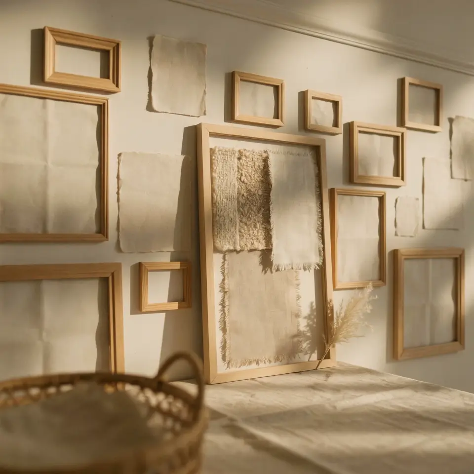
If you have been scrolling through Pinterest looking for that perfect gallerywallframeset, you are not alone. There is something so satisfying about a wall covered with vintage picture frames in different sizes and finishes. It feels collected, personal, and full of stories. But putting one together yourself can feel overwhelming. Where do you start? How do you avoid a chaotic mess? I have been through this process a few times, and I want to share the exact steps I use to create a layered gallery wall that looks intentional instead of accidental. This is a practical how to guide, no fluff, just real tips you can use today.
Step 1: Choose Your Gallery Wall Frame Set with Intention
The first mistake people make is grabbing random frames without a plan. You do not need every frame to match, but they should feel like they belong together. Look for a set that includes at least three to five assorted frames in different sizes. A good starting point is a mix of small square frames, medium rectangles, and one larger statement piece. This variety gives you the flexibility to build a balanced layout.
Pay attention to the finishes. Sets that combine antique gold, bronze, and dark wood tones are ideal because they add depth without clashing. When I shop for vintage picture frames, I always check that the backings are sturdy and the glass is clean. Avoid frames with broken hinges or loose corners; they are more trouble than they are worth. If you are buying online, read descriptions carefully to confirm the frame profiles are not too thin.
Step 2: Layout Planning for Your Assorted Frames
Before you hammer a single nail, lay everything out on the floor. This step saves so much frustration. Arrange your assorted frames in a shape that fits your wall, like a rectangle, an oval, or a freeform cloud. I like to start with the largest frame slightly off center, then build outward with smaller ones.
- Tape kraft paper cutouts to the wall in the exact sizes of your frames. This lets you see the arrangement without damaging the wall.
- Keep about two to three inches of space between each frame for a relaxed, collected look.
- Mix orientations: some horizontal, some vertical, and maybe one square for variety.
- Step back and take a photo. Sometimes the camera reveals spacing issues your eyes miss.
Do not rush this part. Spending twenty minutes rearranging on the floor is better than patching holes later. I have made that mistake, and it is not fun.
Step 3: Mixing Finishes Like Antique Gold, Bronze, and Dark Wood
The charm of an eclectic gallery wall comes from mixing finishes. But there is a trick to making it look cohesive. Start with one dominant finish, maybe dark wood, then add two or three frames in antique gold and one in bronze. The key is repetition. If every finish appears only once, the wall feels disjointed.
I like to group similar finishes on the same side or diagonal to create subtle visual paths. For example, place two gold frames near each other in the upper left, then echo a gold accent in a small frame on the lower right. This ties the whole composition together without making it look uniform. Vintage picture frames often have slight patina variations, which adds to the layered effect. Do not try to polish them all to a high shine. That natural wear is what makes them feel authentic.
Step 4: Selecting Artwork for Your Vintage Picture Frames
What you put inside the frames matters as much as the frames themselves. For a cohesive look, choose a limited color palette. Black and white photos, sepia prints, botanical illustrations, and muted watercolors work beautifully with antique finishes. I avoid bright neons or busy patterns because they fight with the frame details.
Pressed botanicals are a personal favorite. They are inexpensive, easy to find, and look timeless in vintage picture frames. You can also use pages from old books, maps, or handwritten letters. If you want to include personal photos, edit them to black and white or a warm sepia tone. This keeps the wall feeling curated rather than like a family photo collage. Mix in a few empty frames with colored matting for added texture.
Step 5: Hanging Your Gallery Wall Decor Without Mistakes
Now comes the practical part. You have your layout planned and your artwork ready. Use a level and a measuring tape. I prefer to hang the largest piece first, then work outward. For lightweight frames, adhesive picture hanging strips work well and leave no damage. Heavier frames need nails or wall anchors.
One trick I learned: hang the center of your arrangement at eye level, roughly 57 to 60 inches from the
#gallerywallframeset #vintagepictureframes #assortedframes #gallerywalldecor #framedartlayouts
Leave a Comment