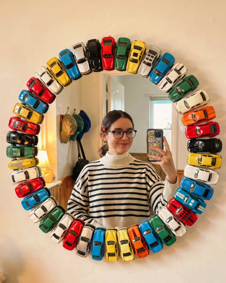
If you have ever tried to put together a gallery wall only to step back and feel like something is off, you are not alone. A well-planned gallery wall can transform a blank wall into a personal, layered story, but one small misstep can make the whole arrangement feel chaotic or unfinished. After helping friends and neighbors with their own wall art arrangements for years, I have seen the same handful of mistakes pop up again and again. Let us walk through those common pitfalls and, more importantly, how to avoid them so your gallery wall becomes a natural, cohesive part of your home decor.
Choosing a Gallery Wall Layout That Fights Your Wall Size
The number one mistake I see is people picking a layout before considering the actual dimensions of the wall. A sprawling, symmetrical grid might look incredible on a huge living room wall but will overwhelm a narrow hallway or a small nook above a desk. Conversely, a tiny cluster of frames looks lost on a large, empty wall.
To avoid this, measure your wall space first. For a small area, try a tight, rectangular arrangement or a single column of frames. For a large wall, spread the frames out more and add bigger statement pieces. A practical tip is to tape out the rough shape of your gallery on the floor or on paper before you drill any holes. This way you see how the overall footprint fits before you commit.
Frame Mixing Tips for a Cohesive Look (Instead of a Messy One)
Mixing frame styles is one of the most popular trends in wall art arrangements, but doing it without a strategy leads to visual chaos. The common mistake is grabbing any old frames that feel “eclectic” and hoping they work. Instead, give yourself one unifying thread. That could be a shared color across all frames (all black, all wood, or all metallic finishes) or a consistent thickness. Maybe every frame is thin and minimalist, or every frame is chunky and ornate.
Another approach is to keep the artwork itself in a similar color palette, even if the frames differ. For example, you can mix a gold frame with a walnut frame if both hold prints with muted green and beige tones. That repetition in the art ties the whole group together. Remember, cohesion does not mean identical, it means connected.
Eye Level Gallery Wall: Why “One Height Fits All” Does Not Work
Many people hang every picture with the center at exactly 57 or 60 inches. That rule is fine for a single piece, but for a gallery wall it often makes the arrangement feel stiff and separate from the furniture below. The mistake is treating the entire wall as a standalone exhibit rather than relating it to your sofa, console table, or headboard.
Instead, think of your gallery wall as a larger composition. The bottom edge of your lowest frame should relate to the top of your furniture. For a sofa, aim to have the bottom of the lowest frame about 6 to 8 inches above the back cushions. For a console table, keep the bottom of the frames within 4 to 6 inches of the table surface. This grounds the gallery wall in the room and makes it feel intentional rather than floating.
Gallery Wall Spacing: The Silent Killer of a Polished Arrangement
Inconsistent gaps between frames is a subtle but noticeable mistake. Even a half-inch difference between spacings can make the whole wall look lopsided. The typical recommended spacing for a standard gallery wall is 2 to 3 inches between frames. For a more casual, salon-style look you can go up to 4 inches, but keep it uniform across the entire group.
A practical trick is to use painter’s tape to mark the outer edges of each frame on the wall, then measure the gaps with a ruler. If you are using a template on the floor, cut paper squares to the exact frame sizes and arrange them there, measuring each gap. Consistency is what gives your gallery wall that finished, curated feel without looking like a random assortment.
Mix Art and Objects for a Richer Gallery Wall Arrangement
A common mistake is limiting a gallery wall to only framed art. That leads to a flat, one-dimensional look. Your wall art arrangements become so much more dynamic when you incorporate small objects like a decorative plate, a small mirror, a textile piece, or even a sculptural wall hook. These three-dimensional elements break up the visual rhythm and add texture.
Here is a list of items that work beautifully alongside traditional frames:
- Small round or oval mirrors (they add light and depth)
- Woven wall hangings or macrame pieces
- Ceramic or wooden decorative plates with mounting hardware
- A small shelf to hold a tiny plant or a ceramic vase
- Shadow boxes containing small natural items like pressed leaves
When mixing objects with frames, treat them as part of the same composition. Keep the color palette consistent and balance heavier objects with lighter ones. A large mirror might need an equally large frame on the opposite side, or a cluster of three small frames to counterbalance it.
Gallery Wall Lighting Mistakes That Dull Your Arrangement
So many people spend hours arranging a beautiful gallery wall and then forget to light it. The result is that the art gets lost in shadows or washed out by harsh overhead lights. A single recessed light directly above the wall often creates unflattering shadows, especially if the frames have glass. The mistake is assuming any light is good light.
For a dedicated gallery wall, consider adding
#gallerywall #wallartideas #homedecor #gallerywallarrangement #walldecor
Leave a Comment