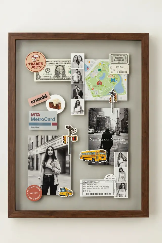
If you are searching for Gallery Wall Ideas that feel personal and genuinely crafty, mixing poster prints with shadow boxes and light boxes is a smart move. But here is the truth: most people try this, make a few common mistakes, and end up with a wall that looks cluttered or flat. I have rearranged my own living room three times before I figured out what works. Let me save you the hassle. This guide walks you through the biggest pitfalls and shows you exactly how to avoid them, using wedding shadow box designs, anime light boxes, and simple posters to get the DIYGalleryWall look you actually want.
Mistake 1: Hanging Everything at One Eye Level
It feels safe to line up frames along a single horizontal line, but it kills the dynamic energy a gallery wall needs. Your eye gets bored fast. Instead, vary the heights and anchor your arrangement around a focal point.
- Try this: Place your largest shadow box or light box slightly off-center at eye level. Then build outward and upward from it.
- Real example: I once hung a wedding shadow box (with dried flowers and a handwritten note) at the center, then layered a vintage movie poster print above it and a small anime light box below. The zigzag movement made the wall feel curated, not random.
- Rule of thumb: Imagine a rough spiral or a staggered grid. Avoid straight rows unless you are going for a formal gallery corridor look.
Mistake 2: Ignoring Negative Space Around Poster Prints
Too many people cram every inch of wall space with frames. That creates visual noise and makes each piece lose its impact. Poster prints need breathing room to shine, especially if they have bold colors or detailed illustrations.
Leave at least 2 to 3 inches between frames. For a tighter look, keep the gaps consistent. For a relaxed, bohemian vibe, vary the spacing slightly but never let any two pieces touch. If you are unsure, lay everything on the floor first and step back. Your wall should feel like a conversation, not a shout.
Mistake 3: Choosing Shadow Boxes That Are Too Shallow or Too Deep
Shadow boxes are fantastic for adding depth, but a wrong depth can ruin the effect. A shallow box (under 1 inch) flattens 3D objects like dried flowers or small trinkets. A box deeper than 3 inches can look bulky next to poster prints and light boxes.
Stick to 1.5 to 2.5 inches deep for most ShadowBoxDecor projects. This depth gives physical objects enough room to cast a subtle shadow without protruding awkwardly. If you are making a wedding shadow box with a fabric piece or a pressed flower, use a box with a slightly recessed mat to keep everything secure. For an anime light box, the depth is usually already fixed, so match the surrounding frames to that thickness.
Mistake 4: Forgetting About Light Box Placement and Power Cords
Anime light boxes look amazing when lit, but they come with a cord. If you hang one in the middle of your gallery wall without planning for the cord, you will end up with an ugly wire dangling across your poster prints. That kills the whole crafty vibe.
Plan ahead. Either place light boxes near an outlet and tuck the cord behind the frame and along the baseboard, or use battery-operated light boxes that run on AAA batteries. Some modern light boxes even have a USB rechargeable battery pack that hides inside the frame. If you do have to use a cord, run it through a cord cover painted the same color as your wall. That trick makes it nearly invisible.
Mistake 5: Mixing Too Many Styles Without a Unifying Element
It is tempting to throw in a vintage botanical print, a minimalist anime light box, a rustic wedding shadow box, and a colorful typography poster all on the same wall. But without a common thread, the result can feel chaotic.
Choose one unifying factor:
- Color palette: Keep all frames and mats in the same wood tone or a consistent black/white.
- Thematic connection: If you love anime light boxes, pair them with anime-inspired poster prints or quote prints from the same show.
- Frame style: Use the same style of frame (thin metal, thick wood, or dark bamboo) for everything except the shadow box, which can have its own distinct shape to stand out.
My own wall uses black frames for all poster prints, a single walnut shadow box for a wedding keepsake, and a white anime light box as the accent. The black frames tie everything together, while the different finishes add visual interest without clashing.
Mistake 6: Skipping the Layout Test on the Floor
Here is a mistake I have made more times than I care to admit. I hung pieces directly on the wall, moved them, made extra holes, and ended up with a patchwork of nail holes. Save yourself the frustration. Before you put a single hook in the wall, arrange your entire gallery on the floor.
Cut out paper templates the
#GalleryWallIdeas #ShadowBoxDecor #PosterPrints #CraftyHome #DIYGalleryWall
Leave a Comment