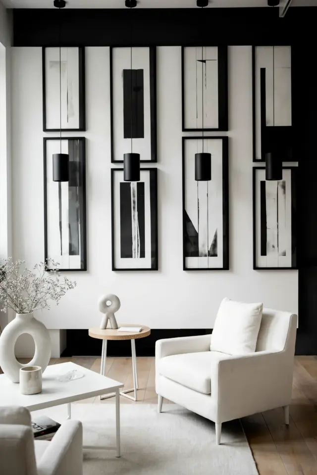
I still remember the first time I tried to hang a gallery wall in my living room. I had a pile of frames, a hammer, and way too much confidence. After an hour of measuring, re-measuring, and making extra holes in the wall, I stepped back to admire my work. It looked like a random scatter of pictures, not the curated, sophisticated arrangement I had imagined. That’s when I realized that good gallery wall layout ideas are not about luck. They are about balancing scale and spacing so the whole wall feels intentional. Over the years I tried different methods, made plenty of mistakes, and eventually found what actually works. Here is the honest, practical approach I now use to get a balanced framed art arrangement every time.
Start with an anchor piece to define your gallery wall layout
Every successful gallery wall I have built started with one non-negotiable rule: pick your largest piece first. That anchor frame sets the visual weight for the entire arrangement. In my own living room I used a 24×36 inch black-and-white photograph, but it could be a bold painting or a vintage mirror. I place that anchor slightly off-center, not dead in the middle, so the layout feels alive rather than stiff. Once that heavy piece is hung, everything else gets placed relative to it. Think of it as the lead singer in a band, the other frames become the supporting musicians. Without a clear anchor, your eye wanders and the wall feels disjointed.
Balancing scale and spacing for a cohesive framed art arrangement
After the anchor is up, the next challenge is keeping the whole thing visually balanced. I learned that framed art looks best when the spaces between frames are consistent, usually 2 to 3 inches between each piece. For larger walls I go with 3 inches; for tighter spaces I use 2 inches. I also vary the scale of the frames. A cluster of all small frames looks like clutter, while all large frames can feel overwhelming. My go-to mix is one large piece, two medium ones, and three to four small pieces. I arrange them so the visual weight stays even across the wall. If a heavy dark frame sits on the left, I balance it with a similarly sized light piece on the right. It takes some trial and error, but I promise it pays off.
How to mix portrait and landscape orientations in your wall art
Early on I made the mistake of hanging only portrait-oriented frames because I thought they looked neat. The result was boring. Now I actively mix portrait and landscape orientations to create rhythm. Landscape frames work well as horizontal breathers between tall vertical pieces. In my current living room I have a landscape print above my sofa, flanked by two portrait sketches. The change in direction draws the eye across the wall instead of letting it get stuck. A good rule: for every three portrait frames, include one landscape. Or if you have a large anchor that is landscape, balance it with two portrait pieces stacked beside it. This mix adds energy without looking chaotic.
Using templates to avoid haphazard placement of framed art
This tip saved me from dozens of extra nail holes. Before I hammer anything, I make paper templates for each frame. I trace the outline of every frame onto craft paper or old newspaper, cut them out, and tape them to the wall. Then I move the templates around until the arrangement feels right. I stand back, squint, and adjust. Once I am happy, I mark the center of each template with a pencil dot on the wall. Then I remove the paper and hang the actual frame using that dot as a guide. It sounds fussy, but it takes ten minutes and prevents the heartbreak of a crooked row. For large groups, I also take a photo of the taped templates so I can compare layouts side by side before committing.
Choosing a layout shape that fits your living room wall
Not every wall needs a rectangular grid. In fact, I have found that flexible shapes often look more sophisticated. For a long narrow wall above a console table, I use a horizontal line of frames with slight vertical variation. For a tall empty space next to a window, I stack frames in a loose vertical column. The shape should echo the proportions of the wall itself. My favorite layout for a standard living room wall is a soft oval or cloud shape: the largest frame at the center, smaller frames radiating outward in a gentle curve. It feels curated but not boxy. Whatever shape you choose, keep the outer edges irregular. A perfectly straight border looks like a store display, not a lived-in home.
Common mistakes when planning gallery wall layout ideas
Over the years I have made almost every mistake in the book. Here are the big ones I now avoid, and how you can skip them too.
#gallerywall #framedart #wallart #homedecor #artlayout
Leave a Comment