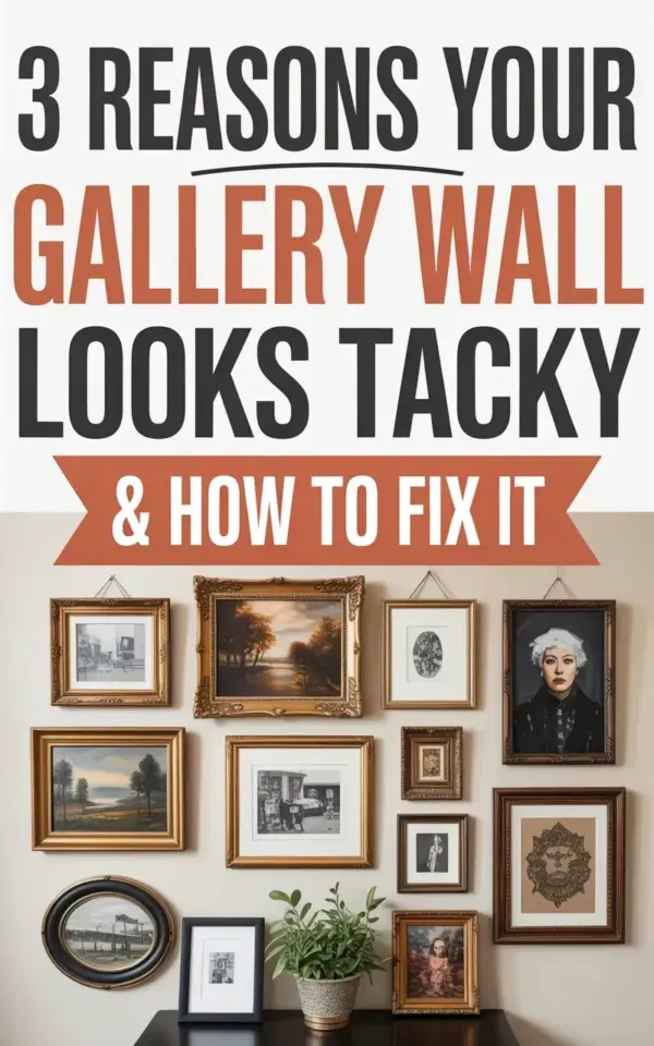
Let me ask you something. Have you ever stood back from your freshly hung gallery wall and thought, “Something is off”? You are not alone. I have seen so many people make gallery wall mistakes that turn a potentially gorgeous display into something that just feels… tacky. Honestly, it’s usually three simple things that go wrong. And the fix? It is simpler than you think. I am talking about that exact scenario: you have a cream wall, a mix of framed artworks, and somehow the whole thing looks like a chaotic jumble instead of a curated moment. That is what this post breaks down.
The Common Gallery Wall Mistake You Probably Make
Look, the number one reason your gallery wall looks wrong is not the frames themselves. It is the lack of a unifying element. People grab random frames from different rooms, mix black metal with gold with wood with plastic, and hope it works. It rarely does. Here is the thing: you do not need every frame to match exactly. That can look stiff. But you do need a thread that ties them together. Maybe it’s the color of the matting. Maybe it’s the style of the artwork (all botanical prints, all black-and-white photographs). Or maybe it’s the frame color family (all warm wood tones, for example).
I once tried a gallery wall with five frames: one chunky white, one thin black, one ornate gold, one rustic wood, and one acrylic floating frame. Not gonna lie, it looked like a yard sale exploded. The fix? I swapped the acrylic and gold for two more wood frames in similar stains. Suddenly the wall breathed. So before you hang anything, lay all your pieces on the floor. Does your eye bounce around? Fix that first.
Spacing Errors That Make Your Gallery Wall Feel Off
Ok so spacing is the classic culprit. Two inches between frames? Too tight. Eight inches? They feel disconnected. I see people cram frames together until they touch, or spread them so far apart you could drive a truck through. The sweet spot is usually 2 to 4 inches between frames. But here is the real trick: consistency matters more than the exact measurement. If you use 3 inches between the top two, use 3 inches between the bottom two as well. Your brain picks up on uneven gaps instantly.
A weird little aside: I have a friend who measures gaps with a piece of string. She knots it at 3-inch intervals and lays it between frames. Works like a charm. But if you want the easy route, just cut a piece of cardboard to your chosen gap size and use it as a spacer. Tape it to the wall, hang a frame, then move it. No measuring tape needed. And honestly, that method saved me from losing a lot of wall anchors.
- Keep gaps consistent – 2 to 4 inches works for most layouts.
- Use a physical spacer – cardboard or a string with knots.
- Test on the floor first – arrange everything, then measure gaps there.
The Height Trap: Why Your Frames Are Too High
Can we talk about height for a second? Most people hang their gallery wall at eye level. Good instinct. But here is the problem: they hang the center of the whole arrangement at eye level, and the top row shoots up toward the ceiling. The result? The wall feels top-heavy and disconnected from the furniture below. The fix is surprisingly simple. Hang the center of your grouping so that the entire arrangement sits with its bottom edge roughly 6 to 8 inches above the back of your sofa or console table. Not the center of the whole wall. The bottom has to relate to something.
I learned this the hard way. I had a beautiful set of vintage bird prints, spent two hours measuring and leveling, stepped back, and my neck hurt looking up. Everything was 6 inches too high. I lowered the whole grid by 4 inches, and suddenly the wall and the sofa clicked. Your eye needs that horizontal line of furniture to anchor the art. Without it, the gallery wall floats in an awkward no-man’s-land.
Gallery Wall Layout Strategy That Actually Works
Here is where most people mess up: they wing the layout. They hang one frame, then another, and suddenly the whole wall is a zigzag of regrets. You need a strategy. Start with your largest piece as the anchor. Place it slightly off-center (not dead center) of the overall display. Then build outward with smaller frames, balancing weight and color. A common approach is the “salon style” grid: all frames organized on an invisible rectangle. Or you can do a loose organic cluster where frames overlap imagined circles. Both work, but pick one and stick with it.
Really odd personal tangent: I once used masking tape on the wall to outline the rough shape of the entire gallery before hanging anything. I traced around each frame’s future location with a pencil. That way I could step back and see the silhouette without any holes in the wall. It looked insane for twenty minutes, but the final result was perfect. No extra nail holes. No second-guessing. So if you are a visual person, try the tape trick. It costs nothing.
Tools and Tricks to Save Your Gallery Wall
Let me give you three tools that turn a headache into a smooth process. First, a laser level. Not a bubble level, a laser level. It projects a horizontal line across the whole wall. You can align your frame tops to that line without measuring each one. Second, use picture hanging strips instead of nails for lighter frames. They let you slide the frame slightly left or right without damaging the wall. Third, invest in frame hangers that have a level built in. They clip onto the back of the frame so you can see the bubble while you adjust. Total game changer.
And one more thing. Do not be afraid to include non-frame items. A small mirror, a wall-mounted shelf with a tiny plant, a ceramic plate – these add texture and break up the monotony of rectangles. I added a small round mirror to my own gallery wall and it instantly made the arrangement feel more collected, less like a hospital waiting room. Just keep the unifying thread. If you use a mirror, make sure its frame echoes the other frame colors.
How to Fix a Gallery Wall That You Already Hung
Ok so you already have a gallery wall up and it looks tacky. Do not panic. You do not need to start from scratch. Here is a quick fix list. Step back and squint your eyes. Which frame feels out of place in color or style? Remove it. Now look at the spacing. Is there a gap that is twice as big as the others? Move a frame to balance it. Is the whole arrangement too high? You can lower it by moving the top row down, but sometimes you only need to adjust the bottom row to relate to the furniture below.
Honestly, most problems are solved by removing just one frame. We tend to overstuff gallery walls because we want to display everything. But a tight, well-edited grouping of 5 to 7 pieces often looks more elegant than 15 random frames. Trust me, I have a friend who had seventeen frames in her hallway. She removed six, regrouped the rest with equal spacing, and it went from chaotic to a feature wall. Less really is more when it comes to gallery walls.
Anyway, the main takeaway is this: your gallery wall does not need to be perfect. It needs to feel intentional. Check your frame unity, your spacing, your height, and your layout. Those four things, fixed one at a time, will turn a tacky wall into a collected, personal statement. Save this post for your next decorating project, and if you try the tape trick, let me know how it goes. I am always curious about what weird methods other people discover.
#gallerywallmistakes #gallerywalltips #homedecor #wallart #decoratinghacks
Leave a Comment