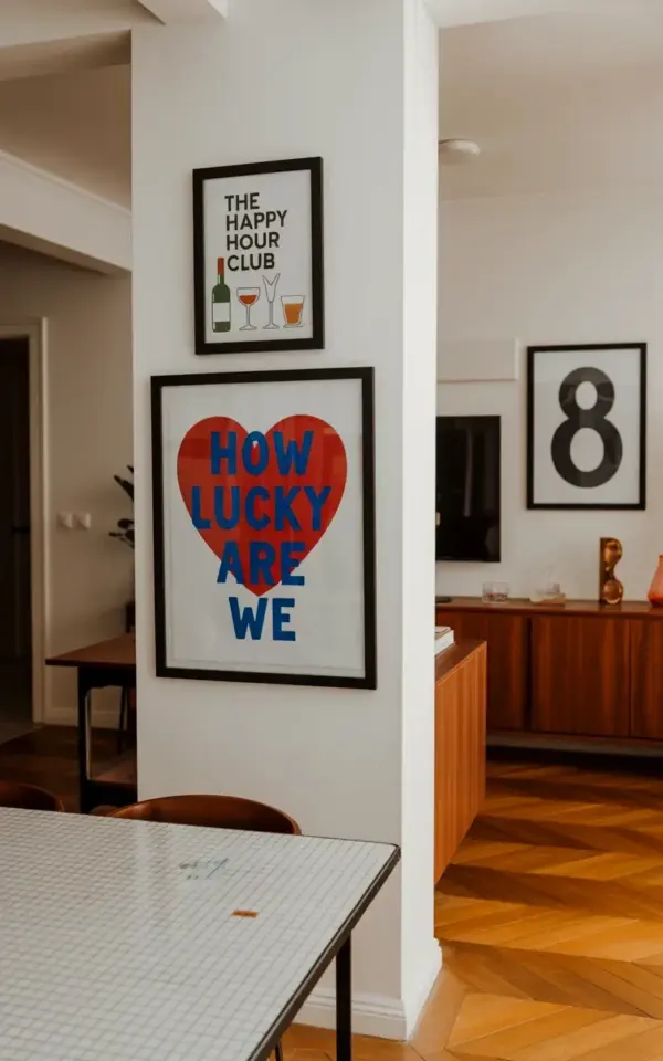
So you found that perfect Valentine’s Day gallery wall on Pinterest with the red heart that says “How Lucky Are We” in that casual blue handwriting. I get it. That picture got me too. It’s not just the heart art though. It’s the whole scene: the wine print above it, the stark black and white number 8 on the side. It feels like a date night that actually happens, not one you stage for Instagram and then forget. Honestly, I’ve been staring at my own blank wall for a week trying to figure out how to pull this off without looking like I’m trying too hard. And I think I cracked it. So let me walk you through exactly how to build this specific gallery wall, piece by piece, so you can get that cozy, romantic vibe without the stress. Because honestly, half the fun is the process of curating it yourself.
Start with the Heart: Picking Your “How Lucky Are We” Print
Look, the heart print is the star here. That red heart with the handwritten blue text is not something you see every day. Most Valentine decor is either screaming red glitter or sad little cupids. This one feels like a private joke between two people. I love that it’s a little crooked in the font, like someone wrote it on a napkin. When you’re hunting for a similar print, focus on that contrast. You want a bold, almost graphic red heart against a clean white background. The blue text should feel casual, not scripty or formal. Think of a sharpie note left on your kitchen counter. That’s the energy.
You can find these on Etsy easily or make your own if you have basic design skills. Just type out “how lucky are we” in a free font like Montserrat or even your own handwriting, drop it over a simple red circle, and print it on matte paper. The key is the frame. A thin black or natural wood frame keeps it from looking too cutesy. You want it to read as art, not a craft project. Also, size matters. In the original Pinterest photo, that heart print is medium-sized, maybe 12×12 inches. Don’t go too big or it becomes the whole room. Let it breathe.
Layer in the Happy Hour Vibe: Why “The Happy Hour Club” Print Works
Above the heart, they hung a smaller frame with “The Happy Hour Club” text and little illustrations of a wine bottle and cocktail glasses. At first I thought, isn’t that a bit on the nose? But then I realized it’s genius. It sets the mood for the entire space. This isn’t a stuffy romantic dinner. It’s a “let’s pour two glasses and sit on the floor” kind of night. And the print itself is playful. That font is retro, maybe a little 1950s cocktail party. It’s not trying to be fine art. It’s a sign. A declaration.
Here’s the thing. You can totally find this print online (I’ve seen it on Society6 and Etsy under “Happy Hour Club poster”) but you could also make a version that’s personal to you. Swap the wine bottle for your favorite beer or cocktail. Add a tiny detail like your anniversary year. Or keep it exactly as shown. The frame should be smaller and simpler than the heart. A black or white basic frame works. Don’t let it compete. It’s the accessory, not the star.
One more thing. I hung mine a little too high the first time. Don’t do that. The top print should be eye level when you’re standing, but the heart should be lower, maybe at chest level, so when you’re sitting on the couch or the floor, you’re looking right at the “how lucky are we” message. That’s the anchor.
The Number 8: A Personal Touch (or Why We Used an 8)
Ok so the number 8. Honestly, at first I thought it was random. A black and white number 8? But then I thought about it. Maybe it’s your anniversary date (October 8th? February 8th?). Maybe it’s your lucky number. Or maybe you just like the shape of an infinite loop. I actually used a 5 in my own gallery wall because we got married on the 5th. That tiny personal detail makes the whole arrangement feel less like a store display and more like your actual life. You can find number prints everywhere. I got mine on Etsy for like 8 bucks in a digital download. Printed it on thick cardstock at Staples for a couple dollars. Frame it in a clean black or white frame similar to the happy hour print. Keep it simple.
The number doesn’t have to mean something monumental either. Maybe you just like the way it looks. I’m not gonna lie, I almost bought a 3 instead of an 8 just because the curves were prettier. But I went with the 5 because it felt like a story. So pick a number that makes you smile. That’s the rule. No number police here.
Arranging the Trio: A Foolproof Hanging Method
Now for the tricky part. You have three frames of different sizes and you need them to look effortlessly placed. The original photo shows the happy hour print directly above the heart, and the number 8 to the right, slightly lower. That’s your template. Here’s a step-by-step that saved my sanity:
- Grab some painter’s tape and outline each frame on the wall before you hammer anything. Trust me, it’s easier to move tape than to fill holes.
- Hang the heart print first at your desired height. For me, that was about 56 inches from the floor to the center of the frame.
- Place the happy hour print above it with about 3 inches of gap between frames. Too close and it looks cramped. Too far and it’s a weird floating thing.
- Put the number 8 to the right, with its top edge roughly aligned with the top of the heart. In the photo it’s lower, but play with it. The asymmetry is what makes it feel human.
- Step back and give yourself permission to adjust. I moved my number 8 three times before I liked it. That’s normal.
And here’s a weird aside. I once hung a gallery wall so perfectly aligned that it looked like a museum exhibit. My friend walked in and said “oh, did you use a laser level?” Not a compliment. You want a little organic shift. A little lived-in feel. That’s the whole point of that “how lucky are we” handwriting. It’s not perfect. Neither should your spacing be.
Styling the Scene: Sideboard, Floor, and Lighting Tips
The photo doesn’t just show the wall. It shows a herringbone-patterned wooden floor and a white column and a wooden sideboard partly visible. That context matters. You can’t just put these three frames on a bare white wall and expect magic. You need a table or a console beneath them to ground the arrangement. A small vase of dried flowers, maybe a single red rose if you’re feeling on-theme. A candle. A bottle of wine just sitting there (even if it’s empty, I won’t tell). The floor should be warmer too. If you have cold tile, put down a rug with some warmth. Anything to soften the space.
Lighting is everything. Overhead light kills the mood. Get a dimmable lamp or even a string of warm fairy lights draped loosely around the sideboard. I used a cheap salt lamp that glows orange. It makes the red heart look even warmer and the black and white number 8 pop. The happy hour print becomes a little silhouette. Honestly, try it with just candlelight for a date night. It works.
And the white column in the photo? That’s a perfect spot to lean a small piece of art or a mirror. Creates depth. If you have a corner wall or a pillar, use it. Don’t force the gallery wall to be the only thing on the wall.
Real Talk: Where to Find These Prints or Make Your Own
I’m all for shopping small. But I also have a printer at home and zero shame. So here are two paths. Path one: Etsy. Search “how lucky are we print”, “happy hour club print”, and “number 8 art”. You’ll find dozens. Spend maybe 15-20 bucks total for digital files. Print at a local copy shop on quality paper (I like a slight textured matte finish). Frame them with inexpensive frames from IKEA or Target. Path two: DIY. Use Canva or even Google Slides. Red heart shape, type your text in blue. For the happy hour club, I literally traced a wine bottle from a stock image and added a martini glass. It took 10 minutes. The number 8? Just type an 8 in a cool black font, size 200, print it. Done.
The point is not to stress over finding the exact prints. The point is the feeling. That feeling when you walk into your living room and see that little wall and it makes you pause and think “yeah, we are lucky.” You don’t need to spend a fortune.
Keeping It Fresh Year Round
Here’s the secret I wish someone told me. You don’t have to take this down after February 14th. Swap out the happy hour print for something else if you want. Maybe a botanical print in spring. Or keep the heart up all year because honestly, who doesn’t need a daily reminder of how lucky they are? The number 8 can stay forever. I’d recommend keeping at least two of the three pieces up. The heart print, I’ll admit, is very Valentine’s. But if you change the text to something more neutral, or just keep the red heart without words, it becomes modern decor. Or you can lean into the seasonality and swap out the bottom print for a different quote each month. I did that one year. October was “pumpkin spice and everything nice.” Total cliche. But I loved it.
Anyway, you get to decide. The framework is solid. The arrangement works. You just need to make it yours.
So go ahead. Pick your prints. Grab a hammer (or some command strips if you’re renting). Pour yourself a glass of something. And build that wall. You’ve got this. And if you do make it, tag me or just send a photo to a friend. That counts. Happy decorating. 🍷❤️
#valentinesdaydecor #gallerywall #heartart #happyhour #romanticdecor
Leave a Comment