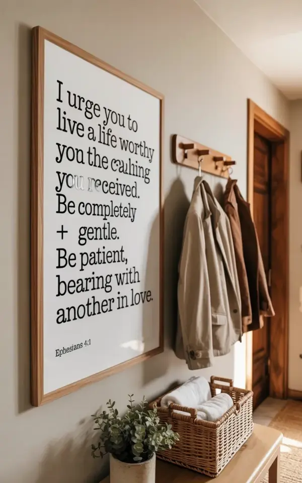
I hung this big framed Ephesians 4:1-2 art in my living room and it totally anchors the wall without feeling busy. Honestly, I was nervous at first. A large Bible verse wall print in a minimalist living room sounds contradictory, right? Big art but minimal vibes. But here is the thing: oversized actually makes minimal easier, not harder. The trick is letting the scale do the work so you don’t need to add anything else. That one piece becomes the focal point and everything else just steps back. I learned this the hard way after years of tiny frames scattered everywhere looking like a chaotic gallery wall at a coffee shop. Not cute. Anyway, if you are wondering how to display scripture wall art without it looking cluttered, go oversized and let the white space breathe. It is genuinely that simple.
Why oversized Bible verse art is easier than small wall decor
Small frames require precision. You have to group them, space them evenly, and hope they tell a story together. It is exhausting. A large framed print does the storytelling for you. One verse. One frame. Done. With something like Ephesians 4:1-2, the text itself has weight and length, so it already fills the visual space. You do not need three smaller pieces fighting for attention. I tried the small-frame route once and spent a full afternoon measuring gaps with a ruler. Never again.
Plus, a big piece on a light beige wall reads as intentional. It looks like you planned it, not like you are just filling holes from old dorm posters. Minimalism is about editing, not accumulating. One large Bible verse print is editing at its finest.
Picking a frame that feels light and minimal
Look, if you put a dark, ornate frame around a large Bible verse, you get a church lobby. That is not the goal here. What works in a minimalist living room is a light wood frame. Think maple, birch, or a pale oak. Something with a matte finish, not glossy. The frame in my living room is exactly that, simple rectangular light wood, and it sits against the wall like it belongs there, not like it is trying to impress anyone.
Here is what I look for in a minimal frame for scripture art:
- Matte or natural wood tone, nothing shiny or dark
- A thin profile, thick frames make the piece feel heavier than it needs to be
- No decorative corners or carved details, plain is the whole point here
- Glass with a non-glare coating if you can find it, otherwise reflections get distracting
- And honestly, white or off-white matting around the print gives the text room to breathe, I recommend at least three inches of mat on each side
One small thing I noticed: my frame has a slight grain visible through the finish. That little texture matters. It keeps the wall from feeling sterile. A completely flat white frame can look like a hospital ID badge. Natural wood grain adds warmth without clutter.
Where to place a big framed print so it anchors the room
Center it on the largest empty wall you have. That sounds obvious, but people get nervous and push it off-center to make room for something else. Do not do that. Let it sit right in the middle at eye level. For me, that meant the bottom of the frame was about 60 inches from the floor. I measured twice because I am paranoid about crooked art. Still ended up slightly off the first time. Had to redo it. Worth it.
Leaving wall space around the frame is what makes it feel minimal. If other furniture crowds the print, the whole room feels tight. Give the piece at least a foot of empty wall on each side, more if you can. My living room wall is about nine feet wide, and the frame takes up maybe four feet of that. The rest is just blank beige wall, and it looks intentional, not empty.
And please do not hang it above a couch that is too tall. If your sofa back goes higher than the bottom of the frame, the art looks like an afterthought. Leave some vertical gap. Six to eight inches between the top of the couch and the bottom of the frame works well.
Using a wooden coat rack to balance a large wall piece
Here is something I figured out by accident. I had this big framed Ephesians 4:1-2 on the wall and the right side of the room felt heavier than the left. Not visually balanced. So I moved a simple wooden coat rack to that side. Nothing fancy, just a basic peg rack in a similar light wood tone. It balanced the composition immediately. The eye now travels from the text on the left, across the blank wall, and rests on the coat rack on the right. It creates a quiet rhythm.
You do not need a coat rack exactly. A tall plant in a plain pot works. A floor lamp with a thin stem. A single slim console table. The point is that the large frame anchors one side and a vertical object anchors the other. They do not compete because the coat rack is open and airy while the frame is solid and heavy. Contrast is your friend here.
Honestly I got the idea because I had nowhere else to put the coat rack. It was sitting in my entryway looking awkward. I moved it into the living room as a temporary spot and realized it kind of worked. Now it stays. Sometimes the best decor decisions come from pure laziness. Not gonna lie.
Letting white space do the heavy lifting in a minimalist room
White space, or negative space, is not wasted. It is the thing that makes your big Bible verse print look expensive and considered. If every inch of your wall is covered, the eye has nowhere to rest. You lose the verse in the noise. But when you leave generous gaps around the frame, the text becomes a statement. It reads like a sentence with proper spacing rather than a run-on paragraph crammed into a margin.
In my living room, the space around the frame makes the black serif font pop. The text says “I urge you to live a life worthy of the calling you have received. Be completely humble and gentle. Be patient, bearing with one another in love.” Then “Ephesians 4:1” in smaller text below. That whole block of words needs room to land. Crowding it with shelves or photos would make the message feel rushed. Let it breathe. The wall itself becomes part of the design.
One weird thing I do: I intentionally keep the floor underneath the print mostly clear. No low bookshelf, no stack of magazines. Just the bare floor and the baseboard. It makes the art feel like it is floating a little. That might sound extreme, but minimalism is extreme simplicity. You have to be willing to have less.
How to choose a Bible verse that fits a minimalist space
Not every verse works well as wall art. Short verses can feel too small on a large print, and super long passages turn into a wall of text no one will actually read. The sweet spot is a verse with a few lines, enough to have rhythm but not so much that it becomes a paragraph. Ephesians 4:1-2 hits that balance. It has movement, a list of virtues, and a clear call. It reads like a quiet reminder, not a sermon.
I would also consider the font. Serif fonts look more purposeful in a minimal space. They feel traditional and grounded. Sans-serif can work too, but it leans modern and sometimes cold. The black text on white background in mine is crisp without being harsh. If you pick a verse you love, try printing it out at home in different fonts before ordering a large print. I did this with three different verses and taped them to the wall for a week. The one that survived my daily staring contest with it won the spot.
And yes, pick a verse you actually want to read every day. I walk past this frame multiple times a day and it catches my eye each time. That changes your mood. It subtly resets your attitude. You do not get that from generic landscape art. So choose something that means something to you, not just what looks good on Pinterest.
A quick note on lighting your large Bible verse print
If you have a picture light, great. But a ceiling light or natural daylight works too. My print gets indirect afternoon light through a sheer curtain and the text looks soft rather than stark. Direct sunlight can wash out the paper over time anyway. Keep it out of harsh rays if you can. I have a small warm-toned lamp on a side table nearby and it casts a glow on the frame at night. That one lamp makes the whole corner feel like a reading nook even when I am just scrolling on my phone.
Lighting is one of those things you do not notice until it is wrong. If your frame casts a shadow that cuts across the text, move it. If the light is too cool, the wood frame looks yellow instead of warm. Small adjustments make a big difference. Spend five minutes at different times of day watching the light hit your art. It is weirdly satisfying.
Styling a large Bible verse wall print in a minimalist living room is mostly about restraint. Pick one piece, frame it light, give it space, and balance it with something simple on the other side. No clutter. No fuss. The verse does the work. Your job is just to get out of its way. If you try this with your favorite verse, I would honestly love to know how it turns out. Drop a comment or tag me somewhere. I am curious what verses you pick.
Leave a Comment