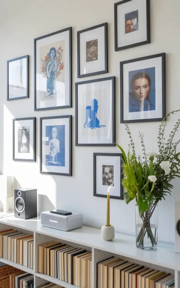
If you have been scrolling through Pinterest looking for that perfect mix of art and storage, a modern gallery wall with blue art and bookshelf decor for a cozy vibe might be exactly what you need. The image that inspired this post shows a clean white wall holding several black frames filled with blue-toned prints and portrait photos, while a white bookshelf underneath carries beige and brown hardbacks and a small black speaker. It is a look that feels curated without being fussy, and it works in almost any room. Let me walk you through seven distinct themes you can pull from this arrangement to create your own version.
Balancing Blue Art with Neutral Book Tones
The blue in those framed prints does not have to fight for attention because the books below stay quiet. Notice in the photo how the hardcovers lean toward beige, cream, and warm brown. Those tones act as a visual anchor, letting the blue figures and abstract shapes breathe. When you choose your own gallery wall pieces, think about what sits on the shelf below. If your art has a cool blue palette, keep your book spines in sandy or clay colors. That contrast creates a calm rhythm instead of a chaotic clash.
For a real example, take the blue-toned illustration of a figure with flowers. That artwork feels airy and soft. Pair it with a row of brown cloth-bound books, and suddenly the whole wall has depth. The books do not compete; they support. This is why the beige and brown books in the photo look so intentional. They are not an afterthought, they are the counterbalance.
Choosing Black Frames for a Clean Gallery Wall
Black frames are a safe choice, but in this arrangement they do something clever. They unify the mix of artistic prints and portrait photos without making the wall feel heavy. The white wall behind them makes the black lines pop, while the blue inside the frames stays the star. If you have ever struggled with mismatched frames, try this: pick one color for all frames and let the art vary. The black frames in the photo wrap everything together, from the minimalist sketch of a figure in blue to the portrait photographs. It is a simple rule that saves you from second-guessing.
One practical tip: go for thin black frames rather than chunky ones. Thin profiles let the art breathe and keep the gallery wall looking modern rather than vintage. The frames in the reference image are sleek, not ornate, which is why the whole setup feels fresh.
Incorporating Portrait Photos for Personal Warmth
Not every piece on a gallery wall has to be a print or a painting. The photo includes several portrait-style photographs among the blue artwork, and that is what gives the wall its cozy, lived-in feel. Those faces add a human element that abstract art alone cannot provide. When you style your own wall, mix in a few black-and-white or soft-toned portraits of people you love. Even a candid shot of a friend reading can break up the formality of the prints.
Position the portraits at eye level or slightly lower if they are smaller. In the arrangement shown, the photographs are scattered among the blue pieces, not clustered together. That scatter prevents the wall from looking like a school photo display. It stays a gallery, not a collage.
Styling a White Bookshelf Below the Art
The white bookshelf in the image is not just a storage unit, it is the foundation of the whole vignette. Its white color keeps the focus on the books and the black speaker, while also echoing the white wall above. If you have a dark or wooden shelf, consider painting it white for a similar light effect. The bookshelf does not need to be full to the brim. Leave a little breathing room between stacks so the eye can rest. In the photo, the books are arranged in small groups, some standing, some leaning, with the black speaker placed off-center for balance.
Think of the bookshelf as a horizontal companion to the vertical gallery wall above. The two zones talk to each other without overlapping. The warm brown book spines mirror the earthy feel of the blue art, and the black speaker picks up the frame color. That kind of intentional repetition makes the whole setup feel designed, not accidental.
Using a Black Speaker as Functional Decor
One unexpected detail in the photo is a small black speaker on the bookshelf. It is not hidden away, it sits there proudly as part of the styling. That is a smart move because it shows that decor does not have to be purely visual. The speaker adds a layer of sound, which is the ultimate cozy touch. When you recreate this look, choose a speaker in a neutral color like black, white, or wood tone so it blends without shouting. Place it next to a stack of books or a small plant, just like in the reference image.
If you are worried about cords, opt for a portable speaker that can be moved around. The black speaker in the photo is clearly a portable model, which gives you flexibility. It also signals that this bookshelf is meant to be used, not just looked at. That is the essence of a cozy vibe, everything in the space should serve both function and feeling.
Arranging Art and Books for Visual Flow
Getting the arrangement right takes a little trial and error, but here is a list of practical tips based on what worked in the photo:
- Start with the largest piece. Place the biggest blue print or portrait in the center or slightly off-center, then build around it. In the image, the blue figure with flowers seems to be the focal point.
- Leave equal spacing between frames, about two to three inches works well. That keeps the gallery wall cohesive.
- Vary book heights. Stack some horizontally and stand others vertically to create rhythm on the shelf.
- Use odd numbers. Three, five, or seven artworks look more natural than even pairs. The photo appears to use a mix of four or five pieces, which still works because the sizes vary.
- Let the bookshelf echo the art. Pull a single blue-covered book from your collection and place it on the shelf to tie the two zones together subtly.
These steps take the guesswork out of styling. You can always rearrange until it feels right, but starting with a clear plan saves time and frustration.
Creating a Cozy Vibe with Texture and Scale
Cozy does not mean cluttered. In the photo, the white wall and white bookshelf provide plenty of blank space, which makes the blue art and brown books stand out. Texture comes from the matte finish of the black frames, the glossy book covers, and the matte paper of the prints. Adding a small plant or a ceramic object on the bookshelf could bring in even more texture, but the photo keeps it minimal with just the speaker and books. That restraint is what makes the look feel calm, not busy.
Scale also matters. The gallery wall should not be too high above the bookshelf. Leave about four to six inches of white space between the bottom of the lowest frame and the top of the shelf. In the image, that gap looks natural and prevents the two elements from squashing together. When everything has room to breathe, the whole corner feels inviting instead of overwhelming.
A modern gallery wall with blue art and bookshelf decor for a cozy vibe does not require a huge budget or a designer. It just takes a thoughtful mix of black frames, blue prints, personal photographs, and a white shelf filled with warm-toned books and one small black speaker. Start with the pieces you already own, then add one or two new prints or frames to fill the gaps. You might find that the most comforting corner of your home is the one you built yourself.
Leave a Comment