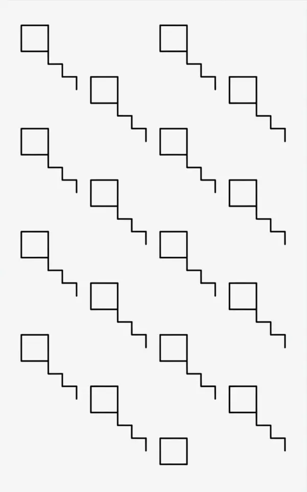
If you have been scrolling through Pinterest for a fresh way to fill a blank staircase wall, you probably stumbled on a black and white line drawing that looks like a diagonal stack of rectangles. That exact image a staircase pattern made of thin black lines, with boxes arranged in a stepped layout, each row getting smaller as it moves down is a perfect example of a gallerywall idea that feels modern but not fussy. That drawing is actually a template you can copy with real frames, and in this roundup I will walk you through five distinct themes to make it your own. Each theme treats the same basic concept (a diagonal stepped arrangement of rectangles) but adds a different twist, so you can pick the one that fits your space and your style.
Why a Staircase Layout Works for Minimalist Decor
The diagonal steps in the photo create visual movement without clutter. Unlike a rigid grid or a salon style wall, the staircase arrangement lets your eye travel naturally from top left to bottom right (or vice versa), which keeps a hallway or reading nook feeling open. Because the boxes vary in size, you can mix small prints with larger ones and still keep the composition balanced. For a minimalist gallery, the key is restraint: use a limited palette (black and white, or black frames with white mats), and let the negative space around the boxes breathe. That is exactly what the line drawing shows a white background with only the essential shapes.
Theme 1: The Classic Black and White Line Art Look
This theme is the closest to the reference photo. You find or create black and white line drawings (simple botanical sketches, abstract geometric patterns, or even handwritten quotes) and frame them in thin black frames with wide white mats. The white mats echo the white background from the image, while the black lines inside each frame mirror the pencil sketch effect. To get the stepped layout, hang the frames so that the top left box is the largest, then each subsequent box steps diagonally downward and to the right, with the smallest box at the bottom right. Leave about 2 to 3 inches of wall space between each frame so the diagonal line stays clear.
- Frame style: Thin black metal or wood, no wider than 1 inch.
- Mat color: Bright white, not cream, to match the high contrast of line art.
- Art source: Free printable line art from sites like Unsplash or your own sketches.
Theme 2: Mixing Frame Sizes for a Stepped Effect
The photo shows a grid like pattern where each subsequent row contains boxes of decreasing size. You can replicate that by choosing three or four standard rectangular frame sizes. For example, start with a 16×20 inch frame at the top left, then a 12×16 inch, then an 11×14 inch, and finally an 8×10 inch. Stagger them diagonally so that the outer corners form a straight diagonal line from top left to bottom right. Do not worry if the frames are not perfectly aligned on the horizontal axis; the staircase effect relies on the diagonal placement, not on a perfect grid. In fact, a slight offset makes it feel more organic and less like a math problem.
Theme 3: Asymmetrical Arrangements for Hallways and Reading Nooks
The biggest mistake people make with gallery walls is trying to center everything. This staircase layout is inherently asymmetrical, which is a huge advantage in narrow hallways or tiny reading corners where you cannot step back far enough to appreciate symmetry. In a hallway, hang the staircase so the largest box is near the ceiling at one end, and the smallest ends up at about waist height near the door. In a reading nook, let the staircase hover above a small chair or lamp
#gallerywall #staircaselayout #lineart #walldecorideas #minimalistgallery
Leave a Comment