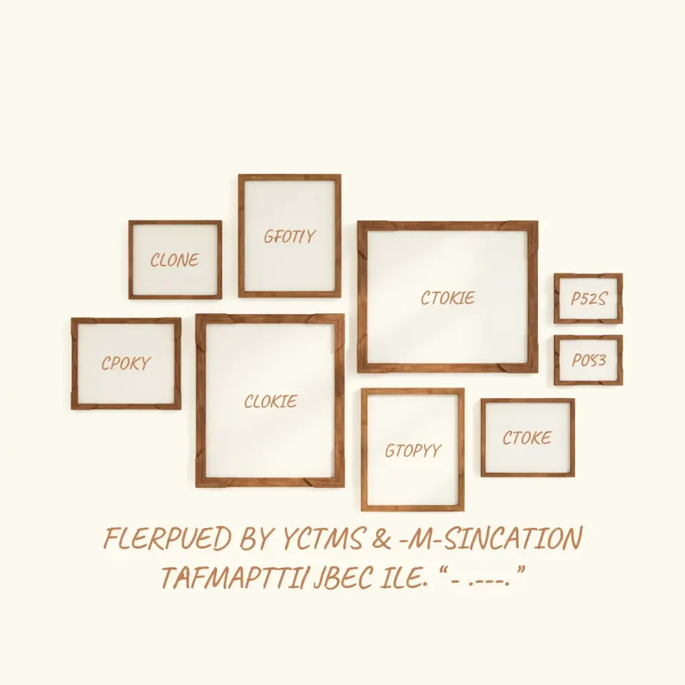
Start with a plan for your vintage gallery wall art set
Creating a cohesive display with a VintageGalleryWallArt set is one of the most rewarding DIY projects you can do for your home. I have personally used antique European prints from digital downloads to turn a bare hallway into a mini museum. The key is to think of it as a puzzle you control. You get to choose the frames, the spacing, and the exact arrangement. No more hunting different shops for matching prints or dealing with expensive shipping. A digital printable art set lets you print exactly what you need, at the size you want, in minutes.
How to arrange a balanced gallery wall layout
Before you print anything, decide on your layout. I always recommend laying the prints on the floor or a large table first. This gives you a real sense of how the pieces work together. A common mistake is hanging them too far apart or too high. For a typical wall, keep 2 to 3 inches between frames. That spacing creates a unified look without feeling crowded.
Start with the largest print as your anchor. Place it slightly off center, not dead in the middle. Then build outward with smaller prints. Mix vertical and horizontal orientations to keep the eye moving. If your set includes a map, a botanical, and a portrait, use those three as a vignette. You can always add more later, but a balanced starting point makes everything feel intentional.
Choosing the right frames for antique European prints
The frame can make or break the vintage vibe. I personally prefer simple wood frames in dark walnut or black. They let the aged tones of the prints shine without competing. Avoid shiny, modern metal frames if you are going for a genuinely antique look. Instead, look for frames with a slight distressed finish or even plain matte black.
If you want a cohesive gallery wall, use the same frame style for all prints. It ties the set together even if the images vary in color and subject. For a more eclectic feel, mix two or three frame colors that share a similar undertone. For example, all warm wood tones or all black and gold. Stick to a maximum of three variations to keep the wall from looking chaotic.
Sizing and paper options for digital printable art
When you download antique European prints, you control the final size. Most digital files come in high resolution so you can print up to 11×14 inches or even larger. For a standard gallery wall, 8×10 and 5×7 sizes work beautifully. I suggest printing at a local copy shop or using a quality online service that offers archival paper.
For the most authentic look, choose a matte or textured paper. Glossy finishes make modern prints feel cheap. Matte paper softens the image and mimics the look of old etchings or engravings. If you want a real antique feel, try a cream or off-white paper instead of bright white. It instantly adds age and warmth to the prints.
Step by step DIY framed art installation
Once you have your prints framed, the actual hanging process is simple if you follow these steps:
- Measure your wall space. Mark the outer boundaries of your planned gallery with painter’s tape. This keeps your layout contained.
- Trace and cut paper templates. Use kraft paper or newspaper to make outlines of each frame. Tape these to the wall and move them around until you are happy with the arrangement.
- Mark the nail or hook positions. For each template, note where the hanging hardware sits. Remove the paper and hammer your nails or picture hooks.
- Hang the frames one by one. Use a level for each piece. It seems tedious, but it saves you from crooked art later.
I like to start from the center and work outward. That way I can adjust spacing as I go. If a print feels off, don’t be afraid to swap it with another. The beauty of a digital set is you can reprint any image if you accidentally damage it during framing.
Mixing vintage prints for a cohesive look
A good gallery wall art set already has a theme. Antique European prints often share a similar palette of sepia, gray, and faded blue. Use that to your advantage. Even if one print is a botanical and another is an architectural sketch, the muted colors and fine line work create a natural harmony.
If your set includes a few prints that feel too modern or bright, you can tone them down. Try adjusting the contrast on your computer before printing, or choose a paper that slightly dulls the colors. Another trick is to group three small botanical prints together on one side and balance them with one large architectural print on the other. The combination of subject variety with consistent color keeps the wall interesting but not messy.
Where to hang your gallery wall set for best effect
Not every wall is a good candidate for a framed layout. I have had the best results in hallways, above a console table, or in a reading nook. The prints should be at eye level, which means the center of the
#VintageGalleryWallArt #AntiqueEuropeanPrints #DigitalPrintableArt #GalleryWallLayout #FramedArtPrints
Leave a Comment