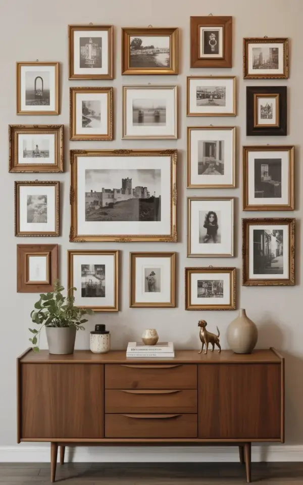
Fifteen Frames, One Warm Beige Wall, and a Little Fall Magic
Fifteen frames, one warm beige wall, and a Sunday afternoon full of second-guessing. That’s how my vintage gallery wall ideas for fall finally stopped being a Pinterest dream and became the thing I walk past every day. Honestly, I didn’t set out to create a themed wall. I just had a pile of old black and white photos and a stubborn love for mismatched frames. Somewhere between the castle photograph and the portrait of a woman I can’t identify, it turned into something perfectly cozy for autumn.
Why the Wall Color Sets the Whole Autumn Mood
The warm beige wall in my hallway does a lot of heavy lifting. It’s not white, not cream, but the kind of soft oatmeal tone that makes afternoon light look honey-colored. For a fall gallery wall color palette, that color matters more than you’d think. Brown and gold frames pop against it, while darker photos stay visible instead of blending into the background.
If you’re starting from scratch, paint the wall first. Actually, don’t paint the wall first. Hang a few sample frames, live with them for a day, and then decide. The beige in my house came from a test pot a previous owner left behind, and somehow it became the anchor for the whole room.
Mixing Gold and Wood Frames Without Losing the Plot
Here’s the thing about mixing gold and wood frames: you need a plan. Or at least a willingness to step back and squint. In my arrangement, about six frames are ornate antique-style gold, with all those little ridges that catch the light. The rest are plain wood, some dark walnut, some almost blond. The contrast keeps it from looking like a museum’s storage room.
One thing that surprised me was how well the simpler wooden frames balance the fancy gold ones. The ornate pieces get to be the showoffs, while the wood frames quietly hold their own. I put a gold frame around a landscape of bare trees, and it instantly felt like something from my grandmother’s house. She would have hated it, honestly. She hated anything that didn’t match perfectly.
Why Black and White Photos Keep Everything Cohesive
All fifteen pieces in my wall are black and white, and that’s the glue. The photos include a landscape with bare trees, an architectural shot of columns and arches, and a large castle photograph that anchors the whole display. Because they share the same monochrome palette, they read as a collection rather than a garage sale.
There’s also a portrait of an older woman with braids, and a portrait of a child sitting on a step. The child has a tiny ink stain on the corner of the photo that I refuse to clean. It looks like a small cloud, and it makes me smile every time. Not everything about a vintage gallery wall has to be perfect.
Arranging an Asymmetrical Gallery Wall Without Overthinking It
I never wanted a perfectly symmetrical grid. That felt too stiff for the fall vibe I was after. So I spaced the frames unevenly, with bigger pieces lower and smaller ones clustered near the top. The castle photo sits slightly left of center, and the smaller frames orbit it like moons. It’s loose, but it’s intentional.
If you’re trying to get the same look, here’s what actually worked for me:
- Lay everything on the floor first and play with the arrangement for way too long.
- Keep the largest piece off-center, not in the exact middle.
- Let smaller frames cluster close together, then leave one big gap that feels weird at first.
- Walk away for a few minutes and come back with fresh eyes.
- Trust the asymmetrical layout, even when your brain wants to line things up.
Hanging 15 Frames Without Turning Your Wall into Swiss Cheese
This part took me the longest. I tried the paper template trick, and honestly it made me love the frames a little less. What worked was hanging the biggest frame first, then working outward from it, using a level but not obsessing. My wall has a few extra nail holes I’ll never admit to. But once everything was up, the small scars vanished behind the pictures.
Look, I’m not a professional. I once hung a shelf so crooked that the books slid off. For this project, I used two hooks for the large castle frame because it’s heavier than it looks. The rest got single nails, and a couple of them are slightly tilted on purpose. Not a single frame is exactly level. That’s the charm.
How to Make the Whole Corner Feel Like Fall
The frames alone didn’t make the space feel like autumn. I had to bring in warm textures. A chunky cable-knit throw draped over the armchair, a couple of candles in amber glass, and a stack of old books on the console table below the wall. The gallery wall became the centerpiece, but the surrounding details make it work.
One afternoon I added some dried leaves in a plain glass vase, and that was the moment everything clicked. The warm beige wall, the gold and wood frames, the black and white photos of places that don’t exist anymore. It all felt like a season you could sit down in and stay a while.
Start with the frames you already own and let the wall tell you where they belong. I’d love to know which frame in the photo is your favorite, leave a comment or save this idea for your next autumn refresh. There’s nothing quite like walking into a room and feeling like the whole space just gave you a hug. 🍂
Leave a Comment