How I found free vintage art without garage sales or flea markets
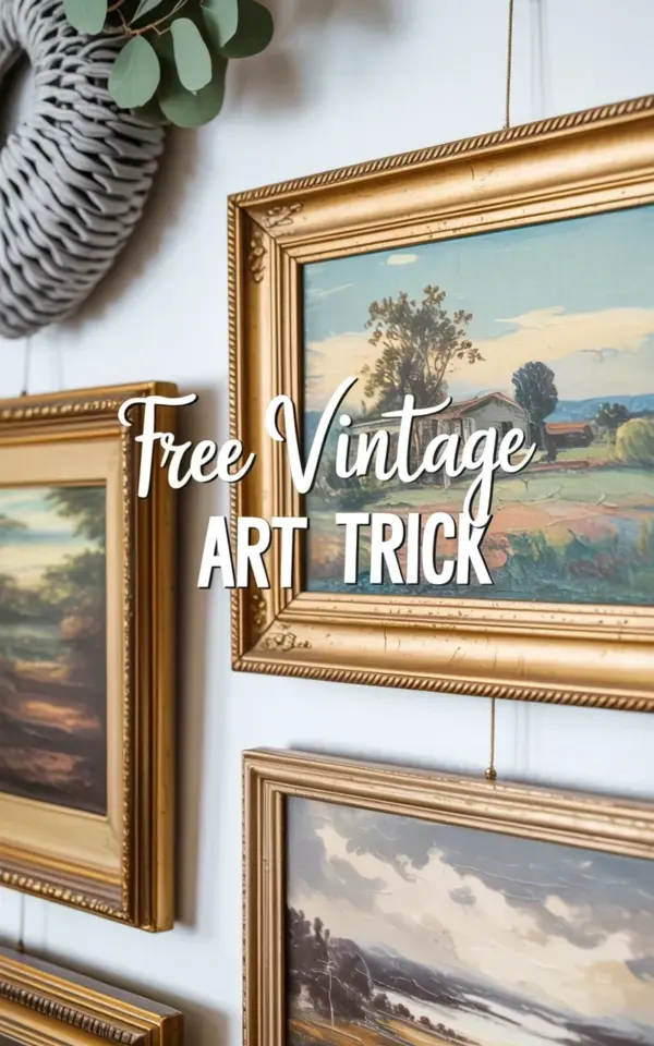
Honestly, the first time I spotted a stack of vintage landscape paintings in gold frames leaning against a curb, I almost walked right past. I was on a walk, mentally composing a grocery list, and not looking for decor. But something about the muted blues and greens in the top painting caught my eye. It showed a little rural house with a tree and rolling hills, all soft and hazy. The leftmost painting was mostly dark brown, almost muddy. The bottom one? Muted browns and grays, like a foggy afternoon. I carried all three home. Turns out, that was my entry point into a trick I keep coming back to: curbside scouting. People toss these things during spring cleanouts without a second thought. Look, you don’t need to hit thrift stores or flea markets. You just need to walk your neighborhood on bulk trash day. And a little patience. That’s it. Not gonna lie, I felt a bit ridiculous hauling dusty gold frames up my stairs. But now they’re the centerpiece of my gallery wall.
Why gold frames make mismatched landscapes look intentional
Here’s the thing about gold frames: they act like a visual glue. Even if your paintings are different sizes, eras, and moods, the gold finish pulls them together. My top painting has a thin ornate frame with detailed scrollwork. The left one is chunkier, more gilded, a little gaudy. The bottom frame is simpler, almost brushed gold. Different shapes, different patinas. But on the white wall, they read as a set. Why? Because golden frames reflect light in a similar warm way. They catch your eye, bounce it from one painting to the next. That makes the arrangement feel curated instead of random. Ok so, another thing nobody mentions: a little tarnish on the frame adds character. I have one frame with a greenish spot near the corner where the metal oxidized. I left it. It looks old and honest.
The best color palette for a cohesive eclectic wall
When you’re stacking found vintage art, you don’t get to choose the colors. But you can guide your search. I look for landscapes that stick to a narrow range: muted blues, dusty greens, faded browns, soft grays. That’s what my three pieces share, even though the scenes are completely different. The top painting is mostly blue-green with that little house. The left one is all dark umber and shadow. The bottom one is a gray-brown fog. They aren’t matchy-matchy, but they sit in the same tonal family. That creates a calm feeling against a white wall. If you grab a super bright painting with red barns or sharp yellow fields, it breaks the whole rhythm. I speak from experience. I once found a gorgeous painting of a sunset over a lake, all orange and pink. Brought it home. Stuck it in the stack. It screamed like a sore thumb. I donated it back. So stick with the muted stuff. It works.
My step-by-step for hanging a stacked gallery wall
Let me walk you through what I actually did, because the photo you see wasn’t an accident. I started by laying the three paintings on the floor and shifting them around until the shapes felt balanced. The top one is the widest. The bottom one is about the same width but shorter. The left one is narrow and tall. That asymmetry works, but you have to check it visually. Then I measured the wall space. My white wall is about 4 feet wide, so I centered the stack horizontally. I marked a light pencil line for the top edge of the top frame. Then I hung that one first. Next, the left painting: I aligned its top edge with the bottom edge of the top painting’s frame. They overlap slightly in the picture, but in reality they just touch. I used a level, but honestly, a slightly crooked frame can look charming with vintage pieces. Don’t overthink it.
- Lay your paintings on the floor first. Move them around until the composition feels right.
- Use painter’s tape to mark the outline of each frame on the wall before hammering any nails. It saves you from extra holes.
- Hang the top piece first, then the one below it, then the side piece. Work from center out.
- Leave a small gap between frames, about an inch or half an inch. Too tight looks cluttered, too wide looks disconnected.
Three things nobody tells you about thrifted landscape art
First, the backs of these paintings are often fascinating. I flipped mine over and found a faded label from a 1960s art supply store in Chicago. Someone’s name was scribbled in pencil. I made up a whole story about them. Probably not true, but it adds a layer of nostalgia. Second, the smell. Old canvas and wood frames have a specific musty scent. Not gross, just old. I let mine air out on my porch for two days before hanging them. Some people wipe them with a barely damp cloth, but I didn’t risk the paint. Third, the glass. A lot of vintage frames come with old glass that’s wavy and slightly cloudy. Some people swap it for museum glass. I kept mine. The waviness makes the paintings look softer, more dreamlike. It’s a feature, not a flaw.
What I learned from this specific arrangement
Look at the photo again. Notice how the top painting has that bright rural house? It draws your eye up. The left painting, all dark brown, acts like an anchor on the side. And the bottom painting, with its gray-brown tones, grounds the stack. That interplay of light and dark is what makes the whole thing work. I didn’t plan it. I just happened to pick these three. But now I actively search for that contrast. One piece with a light sky, one with deep shadows, one in the middle range. It gives the wall depth. Also, the white handwritten-style text overlay in the photo? I added that digitally just for the pin. In real life, the wall is bare. That’s how I like it. Let the vintage art speak.
Anyway, the whole project cost me zero dollars and maybe an hour of my time. That’s the best part. You don’t need to spend money to get a gallery wall that looks collected over years. You just need to keep your eyes open and not be afraid to drag home a dusty painting in a gold frame. Go ahead. Try it. Pin this so you remember the trick later. And if you find something weird, like a painting of a cow in a completely different style, bring it anyway. Sometimes the mismatches are the best part.
#vintageart #gallerywallideas #freeart #goldframes #landscapepaintings
Leave a Comment