Throwing together a vintage memory board is one of those projects that looks deceptively simple from across the room. You see a framed collage of old photos, a clipped magazine page, some random trinkets, and you think, “I could do that in an afternoon.” Then you actually try it, and your wall ends up looking like a messy corkboard from a chaotic dorm room, not a curated piece of budget DIY art. I’ve been there, I’ve pulled the tacks out in frustration, and I’ve figured out exactly where the whole process goes sideways.
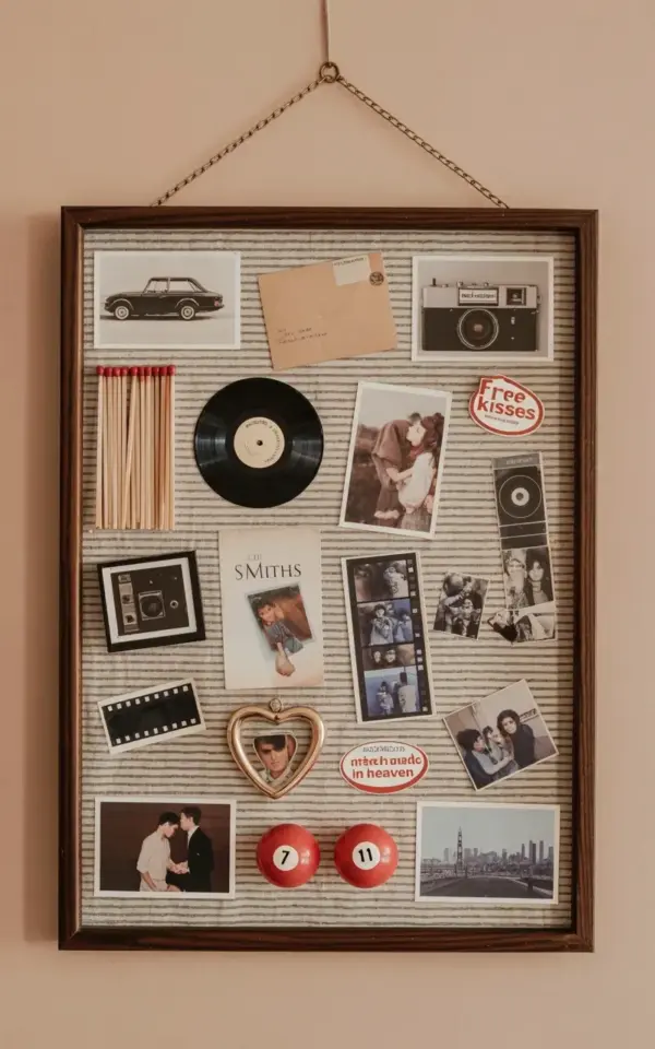
The specific board I’m looking at right now is a great example of getting it right. It’s a dark brown wooden frame holding a collection pinned onto a striped gray and white wallpaper background. A Smiths album cover sits right in the middle, a black vinyl record leans against it, and somehow a pair of red pool balls numbered seven and eleven look completely at home next to a heart-shaped locket. The secret isn’t having better stuff than you do. Look, the secret is avoiding the same five mistakes everyone makes when they start this project.
The Design Mistake: Starting With No Direction At All
Honestly, the biggest failure is walking into a thrift store and grabbing anything that vaguely looks old. You end up with a pile of unrelated junk that fights each other for attention on the wall. Before you buy a single thing, decide on a feeling you’re chasing. Are you going for dark and moody, like this board with its black car illustration and film strip negatives? Or do you want light, airy, and romantic with lace and pastel postcards?
Pick a color story, too. It can be loose, but it needs to exist. This vintage style collage works because almost everything in it is black, white, gray, or a muted red. The red pool balls pop because they’re the only bright spot in the whole arrangement. If you throw in a neon pink sticker next to a sepia photo, you’ve lost the plot.
The Budget Mistake: Ignoring The Frame Aisle
Here’s the thing about the frame. A good frame is the backbone of a vintage memory board, and it’s also where people try to save five bucks and ruin the whole look. Do not buy a flimsy new poster frame from a big box store. The plastic edges will cheapen everything you put inside it. Instead, spend your money on a solid wooden frame from a charity shop, or even better, a flea market.
That dark brown wooden frame in the photo is doing so much heavy lifting. It grounds the busy wallpaper background and makes the whole thing feel intentional. Look for frames with character, maybe a little worn, maybe with a weird paint finish on the corners. If it’s the wrong color, sand it down and stain it, that’s a separate thirty minute project. Skip the frame entirely and you’ve pinned your memories straight onto the drywall like a serial killer’s investigation board, which is a vibe for some people, but not usually the vintagevibes you want.
The Worst Mistake: Hanging Things At Perfect Eye Level
I have a weird thing about this. Everyone hangs art at exactly 57 inches from the floor because some gallery guide said so. But a vintage memory board is not a gallery painting. It’s a messy, personal, tactile object. It should sit where you naturally look at it, often a bit lower, often near a cozy chair or a sideboard.
And here’s a mild complaint I have about this specific board’s placement. It’s on a beige wall, and whoever hung it put it right at the perfect viewing height for someone sitting down, not standing up. That’s the move. If you’re mostly going to be on the couch, hang it lower. If it’s above a desk, hang it so it’s level with your eyes when you’re typing, not when you’re standing awkwardly in the middle of the room trying to measure.
The “I Need More Stuff” Trap Runs The Other Way
Ok so the opposite problem happens too. You get excited, you buy 200 items, and you try to cram every single one into the frame. No. A vintage memory board needs breathing room. It needs a few hero pieces and some supporting characters.
This board is a masterclass in restraint, honestly. Consider its components:
– A black vinyl record and The Smiths album cover as the big anchors
– A vintage camera photograph and a postcard envelope for texture
– A heart-shaped locket with photos as the emotionally heavy piece
– Matchsticks and a “Match Made In Heaven” stick for a punny touch
– A “free kisses” sticker for that raw, human randomness
– Red pool balls as the unexpected color pop
Notice what’s not on the board. There are no random keys, no lone earrings, no crumpled receipts. Every single piece earns its spot. If an item doesn’t tell a story or make you smile when you see it, it goes back in the shoebox. I once put a box of matches on a board just because I liked the vintage typography, and it looked great until I realized it was just a floating rectangle of red with no context. Painful.
The Layout Mistake: Throwing Everything At The Wall Symmetrically
This is a tricky one. If you space everything out evenly, the board looks like a scientific specimen, cold and dead. But if you overlap everything at a slight angle, it looks like a mess. The sweet spot is somewhere in between. You want the pieces to touch. You want them to overlap by a fraction of an inch. You want the negative space to be uneven on purpose.
Notice how the film strip negatives weave through the middle of this collage like a ribbon. They’re not just placed, they’re arranged to lead your eye from the locket to the Smiths cover and over to the vintage camera picture. That’s deliberate. The pool balls break up the rectangular monotony of all the paper items. If you have too many square and rectangle things, throw in a circle or a curved object. A coin, a round badge, a circular mirror.
The Final Mistake: Forgetting The Background Matters
Most people pin things to plain cork and call it a day. That’s the most boring possible choice. The striped gray and white wallpaper background in this board is doing work that no number of added trinkets could match. It adds texture and depth without adding clutter. You can use a vintage map page, sheet music, a patterned gift wrap, or an old book page. Just make sure the pattern doesn’t fight your items for attention.
This is also the place to save money with budget DIY cleverness. If you don’t have wallpaper, use a section of a large envelope, a paper grocery bag, or a page from an old atlas. Once you have the background and the frame locked in, the actual placement of items takes ten minutes instead of two hours. And when you step back, see the whole thing together, that’s the moment it becomes real vintage memory board art instead of a pile of pretty garbage.
Creating something like this takes a little patience, a trip or two to the thrift store, and the willingness to rearrange the same pin five times until it clicks. Just avoid these mistakes, and you’ll get a board with actual vintagevibes, not a chaotic mess. Now go dig through that box of old photos you’ve been ignoring, and let me know what ends up on your wall.
Leave a Comment