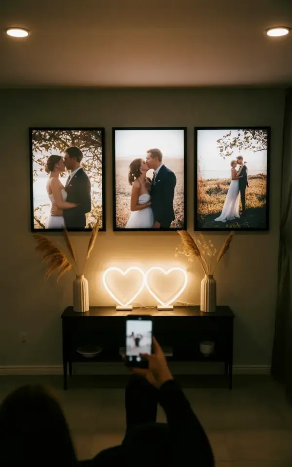
The glow from those white neon hearts is doing a lot of heavy lifting. I saw this exact setup in a dim corner of a styled shoot, and honestly, it stopped my scroll. It’s a wedding photo gallery wall idea that doesn’t scream “shabby chic” or “stiff formal portrait”; it sits right in that sweet spot of romantic but unfussy. The triptych layout over a black console, the dried pampas, the soft neon, it all works because it feels collected, not just decorated.
You’re probably here because you have a stack of wedding photos and zero idea how to display them without turning your living room into a shrine. I get it. Most gallery walls look chaotic or overly curated, like a furniture store showroom. This setup, the one in the photo with the phone snapping away, is the exception. It’s bold, it’s textured, and it’s very seasonally aware if you’re planning to update your space for fall or winter.
Why a Triptych Still Feels Fresh for Wedding Photo Displays
Three frames in a row is an old rule, but this arrangement makes it feel new. The trick here is the size. We’re not talking about tiny 5x7s lost on a big wall. The frames are large, probably 16×20 or bigger, and they’re hung with equal spacing to create a strong horizontal line. That line anchors the entire room.
The photos themselves are all outdoor shots with natural light. No harsh flash, no overly posed studio portraits. When you choose images for a triptych, pick moments that share a similar color palette. If one photo has a deep green forest and another has a bright golden field, they’ll fight each other. Keep the tones consistent. Look for movement too, a veil catching the wind, a hand squeeze, a mid-laugh glance. Static poses look like mugshots at this scale.
Balancing the Warmth: Gray Walls, Black Consoles, and Neon Hearts
Here’s the thing about a gray wall: it can feel cold if you let it. The black console table underneath grounds the whole composition, giving the airy frames something solid to rest on visually. But it’s the white neon hearts that save the day. They add a modern, almost retro-diner warmth that stops the gallery wall from feeling too precious or museum-like.
The hearts are mounted on the console, not on the wall behind the photos. That’s a deliberate choice. If you put them on the wall, they’d compete with the frames. Down low, they draw your eye to the table surface and create a layered look. I love that they’re white instead of pink or red. Pink would lean too girly, red would feel like Valentine’s Day exploded. White feels like a soft glow, almost like a candle flame in a city apartment.
The Pampas Grass Factor: Texture Over Flowers
Pampas grass is everywhere right now, and for good reason. It brings a feathery, airy texture that fresh flowers simply can’t match in this context. The two white vases on either side of the console create symmetry, but the grass itself is wild. It breaks the perfect lines of the frames and the table, which is exactly what you want. Perfection is boring.
Honestly, you could swap the pampas for dried bunny tails or even a few stems of eucalyptus if you’re not into the fluffy look. But don’t skip the texture entirely. If you have a slick black console and smooth frames, you need something organic to soften the edges. The pampas does that. It also catches the light from the neon hearts in a really pretty way, which is a subtle bonus you won’t notice until the sun goes down.
How to Arrange Frames Over a Console Table: No Measuring Tape Required
Look, I’m not gonna lie, I’ve hung things by eye and regretted it. If you want the exact look from the photo, you need to lay the frames on the floor first. Arrange them on the ground in front of the console to get your spacing right. Then, cut out craft paper to match the size of each frame and tape the paper to the wall. It’s the easiest way to see the layout before you commit to hammering nails.
One practical tip: keep the center frame perfectly level and let the outer frames follow the same height. In the photo, they’re all aligned on the same top edge. If you stagger them, you lose the clean, modern feel. Also, leave about 4 to 6 inches between the bottom of the frames and the top of the console. Too much gap and they feel disconnected. Too little and they look cramped.
– use kraft paper templates before putting holes in the wall
– hang the center frame first and work outward
– keep 4 to 6 inches between frames and the console top
– match frame colors to the room’s hardware, black or walnut works best
Seasonal Styling: Making This Work for Fall and Winter
This wall setup is a transitional chameleon. In autumn, the pampas grass plays perfectly with warm neutrals and knit throws. In winter, the white neon hearts feel like a cozy counterpoint to cold weather. If you’re styling for a January wedding anniversary, this is your look. It’s cozy without being heavy.
What’s great is that you don’t have to redecorate for the seasons. Just swap out a few small details. Drape a chunky knit blanket over the console in winter. Add a small stack of coffee table books in autumn tones. The core elements, the triptych, the pampas, the neon, they stay constant. It’s a display that grows with your home and doesn’t feel dated by the wedding Pinterest phase passing.
Practical Lighting Tips for a Dim, Moody Gallery Wall
Now, let’s talk about the light in that photo. It’s dim. The phone is visible at the bottom because the photographer (or the bride) had to capture it in low light. Don’t be afraid of this. Not every wall needs to be blasted with recessed lighting. A gallery wall in a dim corner feels intimate, like a little moment you stumble upon.
The neon hearts act as your primary light source for the table, but they won’t light the photos. Consider a picture light mounted on the top of the center frame. Or, use a small plug-in wall sconce above the triptych. Warm bulbs only. Cool white light will ruin the mood instantly. Also, point the neon hearts slightly outward if you can, so they illuminate the vases and not just the wall texture.
Why This Setup Works for Small and Large Rooms Alike
It’s easy to think a triptych needs a huge wall. It doesn’t. The console table takes up minimal floor space, and the vertical height of the frames creates a feeling of grandeur without consuming square footage. In a small apartment, this could be the focal point of the entire room. In a larger space, it works as a secondary seating area or hallway moment.
The key to scaling is the size of the furniture. Don’t pair a short, skinny console with massive frames. The proportions will look off. In the photo, the console is long and low, which lets the frames read as a solid block above it. If your console is taller, choose a three-frame set that’s wider rather than taller. Or just increase the gap between the frames and the table slightly.
There’s also a practical element here. This is a wedding photo display that’s actually easy to dust. No fiddly little frames scattered across shelves, just three big panes of glass and some dried grass. I hate dusting small trinkets. This setup respects that.
The whole vibe is intentional. It’s a curated corner that says you put thought into your memories, but you also know how to relax. When people come over, they’ll walk up to it, look at the photos, and then touch the pampas. It’s interactive, which is rare for wall decor.
So, if you’ve been staring at your wedding photos in a box under the bed, let this be your nudge. Grab three large frames, find a console or a long media table, and order some pampas grass. Honestly, the neon hearts are the finishing touch that makes it feel special, so don’t skip those either. Have you tried a neon sign or a triptych layout in your living space? Let me know what your frame setup looks like, I’m always stealing new ideas for my own walls.
Leave a Comment